Mapping Time both Eternal and Material with Gretar Reynisson

Mapping Time both Eternal and Material with Gretar Reynisson

Mapping Time both Eternal and Material with Gretar Reynisson

Although possessing a material reality, time exists without needing to be represented nor is its representation necessary in the experience of time. With time-based artwork such as that by Gretar Reynisson, the experience of time is visualized into a form on the minute line between the personal and the universal. The experience of time is given aesthetic effect as ‘the time of art’ itself. It is not comparable to the time of the museum’s opening hours, or the duration of a film, or the time it takes to get from one place to another, although it can contain all of these elements. 

Space and time, as the foundations of human perception, fragment and perform a distortional effect on the senses depending on how it is framed. Time appears as linear with the past disappearing and the future on the horizon, with the present as a stepping stone balanced somewhere in between. This is the place, the moment, and the vicinity in which Gretar Reynisson expands his timeline, creating a ripple in the timeline of those who come into contact with his work. These time-based works create a ripple all their own, affecting the ‘time of art’ itself.

By measuring time with the precision of its material reality, he has expanded the present moment by mapping time with ritual and material, but it is not the ritual that would require any incantation, as it is the expanded moment of daily life where it is lived every day in the very physicality of the body and its processes that the real transformation from one moment in time to the next is charted. Something in the experience of this mapping of time automatically gathers a momentum all its own, and it is part of the map that you don’t have to see to know that time will indeed continue without this mapping. This knowledge overlaps with the everyday map of time, and you see and know that time will continue into eternity and we are tiny blips on that eternal map.

20 40 60

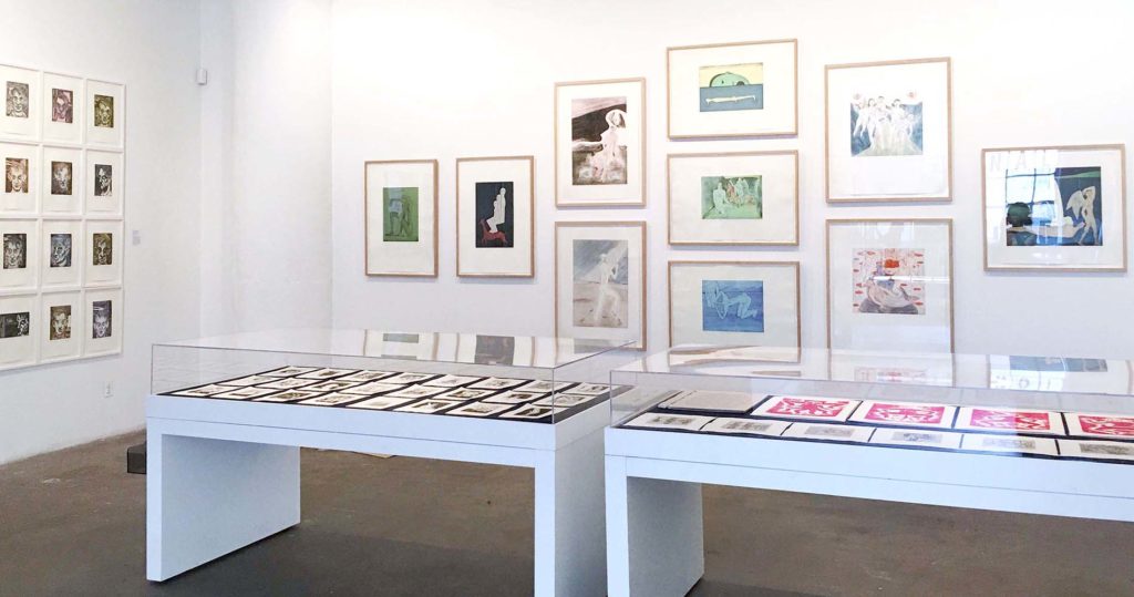
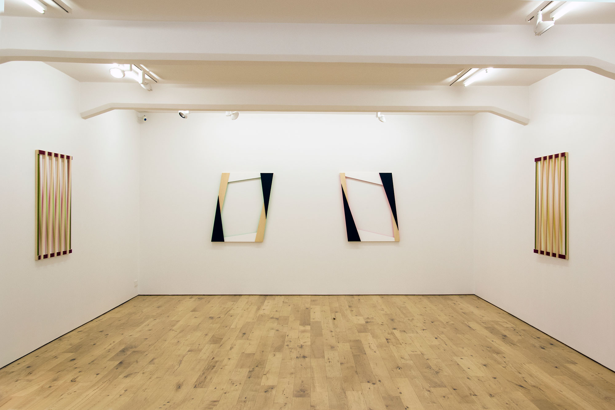
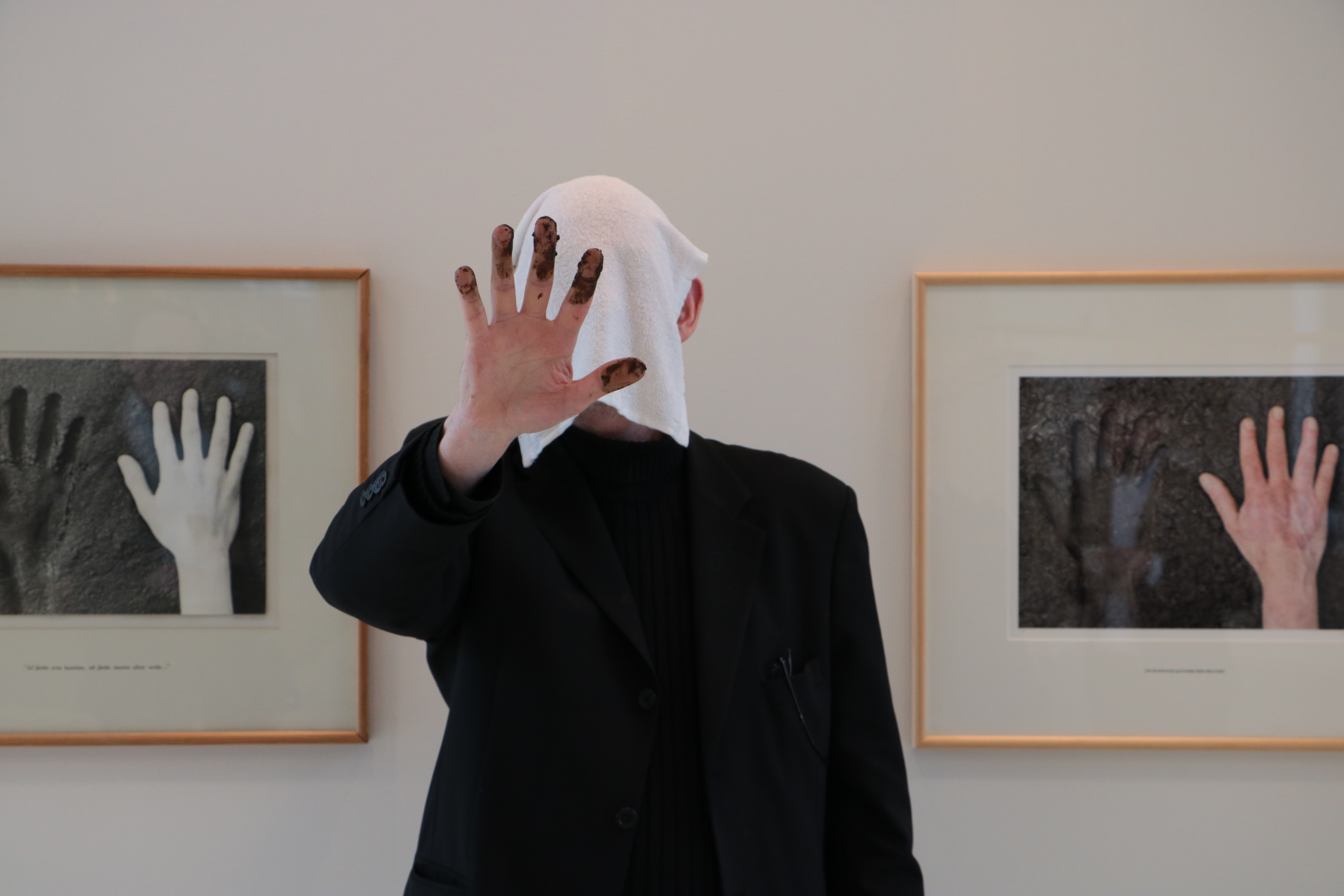
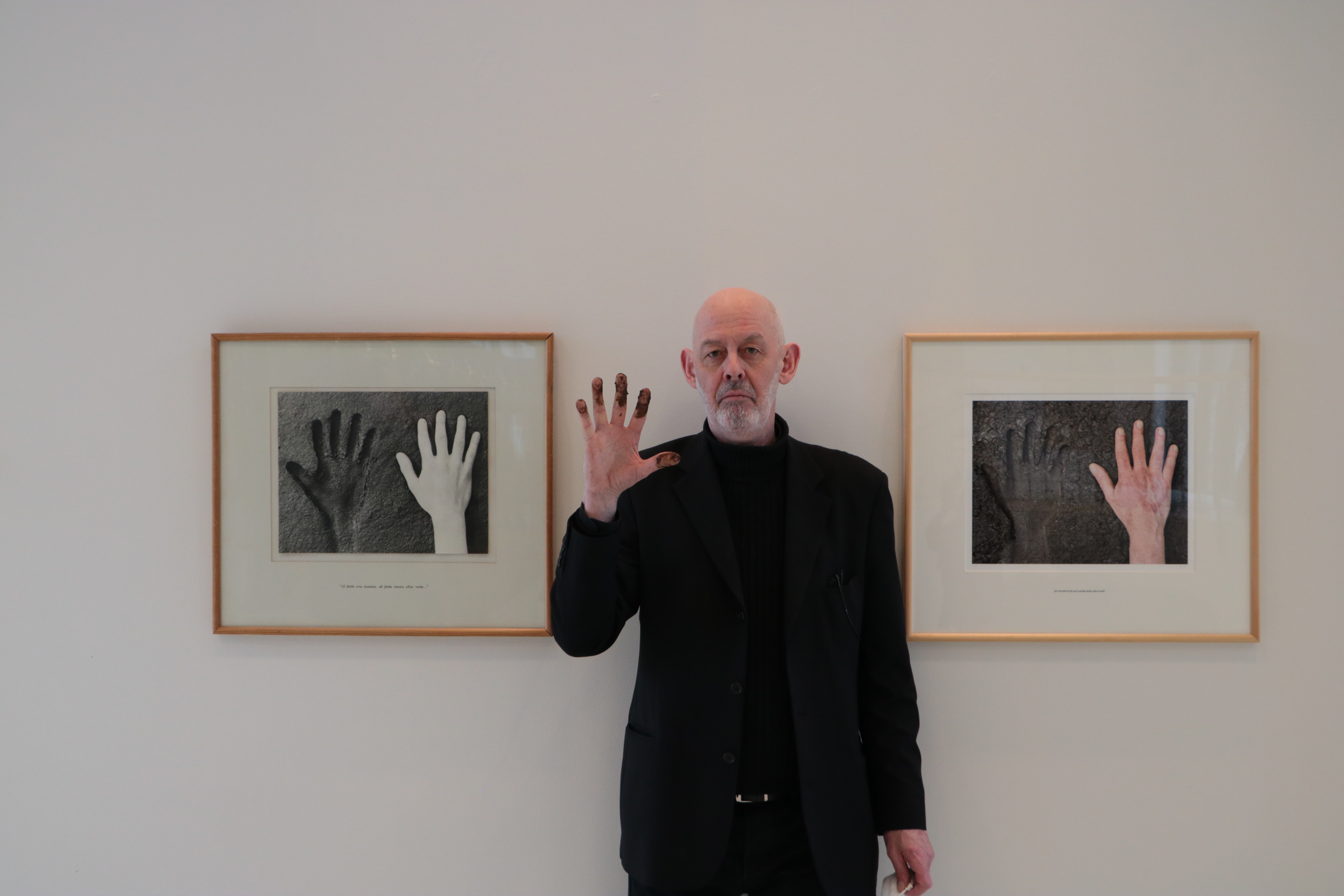
At Neskirkja from April 2nd to June 25th, 2017, the artist presents the exhibition 20 40 60, celebrating the 60th birthday of the artist as well as the 60th birthday of the church itself. The title comes from a photograph the artist took 40 years ago at age 20, of his hand next to the impression his hand has made in mud, which the artist restaged earlier in 2017. Both photographs can be seen in the exhibition, each referencing the line from Genesis 3:19- By the sweat of your brow you will eat your food until you return to the ground since from it you were taken; for dust you are and to dust you will return.

During a performance accompanying the exhibition, guests were invited to make their own fingerprint impressions with mud on the walls inside the church’s gallery- 500 to be exact. This corresponds to the 500 years that have passed since Martin Luther nailed his Ninety-Five Theses to the door of the castle church in Wittenberg Germany, which marked the beginning of the Reformation and changed the course of history. At Hallgrimskírkja, the artist has filled the vestibule of the church with 500 nails each with a corresponding tag for the years between 1517 and 2017. This exhibition, titled 501 Nails is on exhibit from May 21st to August 21st, 2017.

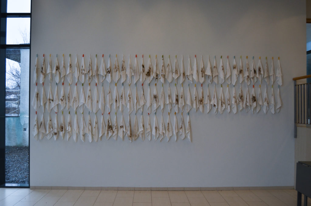
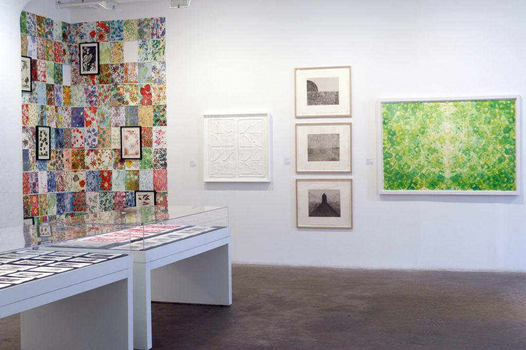
On the exhibition walls at Neskirkja, the fingerprints are like constellations with the tiny crevices of individual lines inside each marking visible. On the opposite wall, you see the white towels that each person used to clean the excess mud from their fingers as another kind of memento mori of the body in its interaction with surfaces and materials. With these impressions, it is as though the material evidence is what holds the memory of time between realms. The material tells us everything we know and brings the viewer or participant into the epic story in which we all take part. There is something reminiscent of a wall of prayer where people come to meditate in the mud fingerprints. With the ancient text reminding us that we shall return to this earthly material, the span of time between becomes impressionable- as the fingerprints pressing on the walls of the church are attempting to weigh the structure itself and what it stands for against the existential weight of time that we face every day.

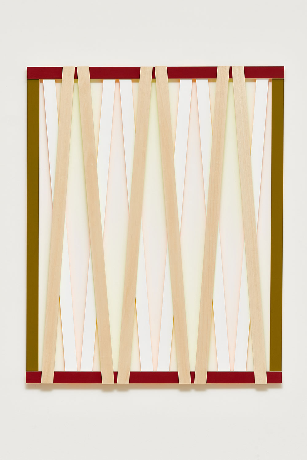
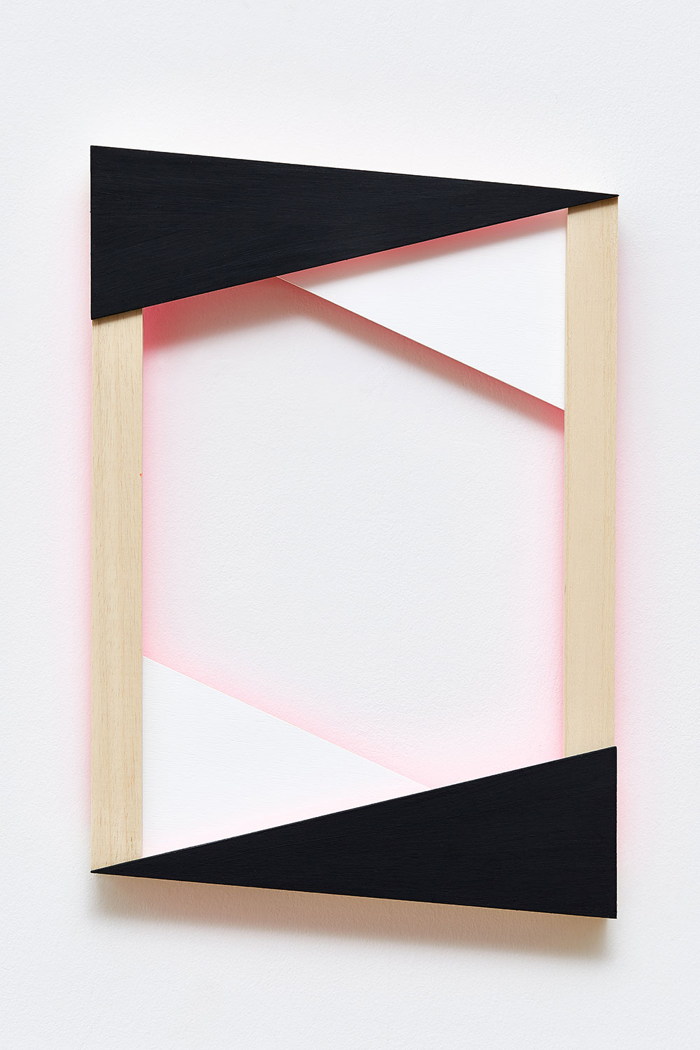
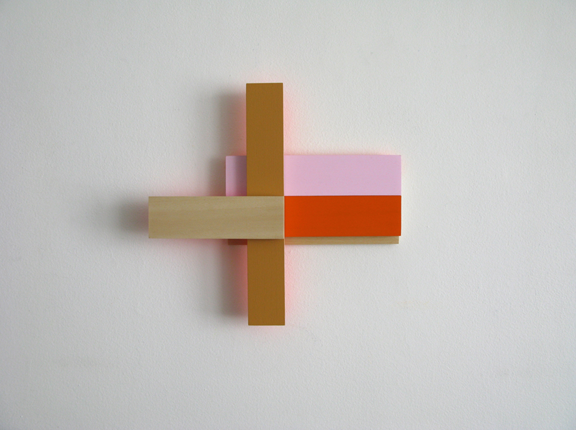
Like the still-life painting theme memento mori which began as early as the 16th century and was most renowned in Northern Europe, the mud fingerprints are one in the same as the objects so often depicted: rotting fruit and vegetables, withering flowers, skulls, hourglasses, smoke, bubbles, and usually a surface with the glint of a reflection of the artist themselves. These objects symbolized the ephemeral quality of life in its fleeting nature, a precursor to time-based artworks. The artist considers the quality of time as a subjective, interactive entity in which the practice of image-making is tandem with learning how to visualize time. The phenomenologist Maurice Merleau-Ponty described the act of perceiving as an act akin to drawing: “definite qualities only draw themselves in the confused mass of our impressions if it is put in perspective and coordinated by space.”[1] In this way, Gretar Reynisson’s mapping of time with material objects in his everyday life brings order to this massive array of perceptions shaped and gathered by time and space. He maps the coordinates as a meditation on being present in the everyday.

More About the Artist’s Previous Time-Based Works
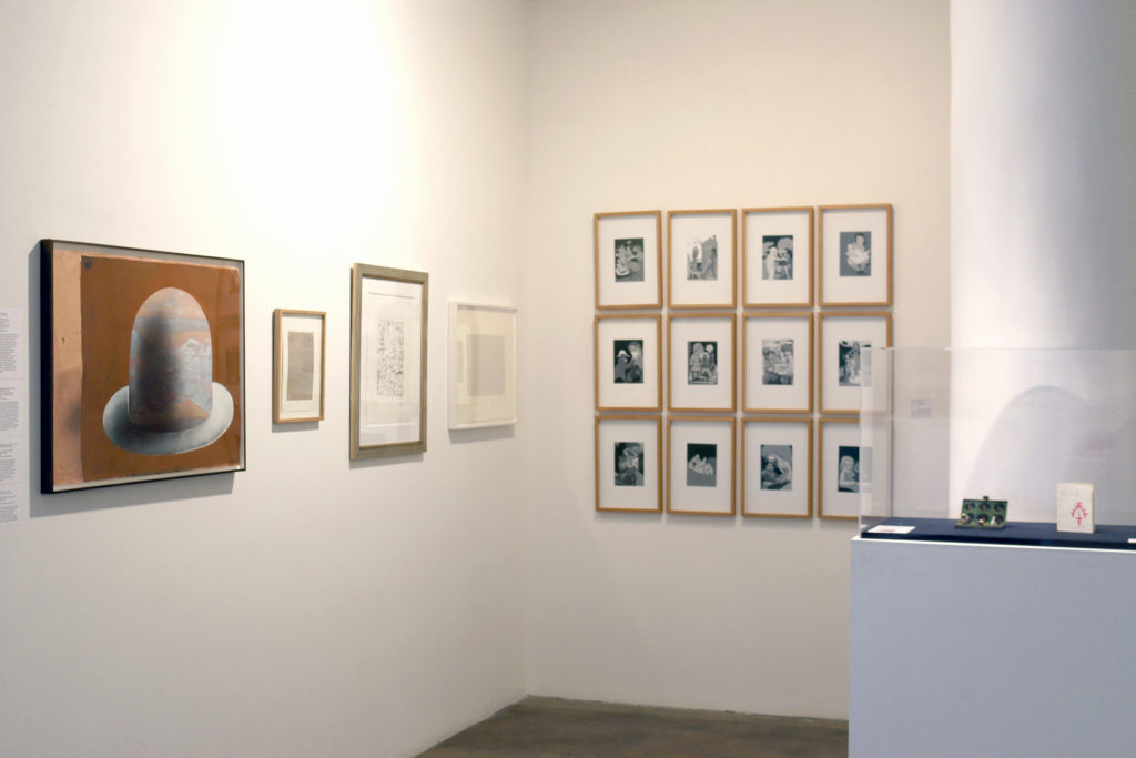
1,461 Days

Twenty years ago, Gretar Reynisson began a series of works in which time and the objects making up the artist’s everyday life were interwoven. Work produced in this manner was exhibited at Kjarvalstaðir in 2001 under the title 1,461 Dagur (1,461 Days) corresponding to the time period from January 1, 1997 to December 31, 2000. In 1,461 Dagur, the artist methodically worked over four years, with each year documented according to, in chronological order: days, weeks, months, and finally, a year.

In 1997, each day was recorded as a graphite drawing onto a 12 x 12 cm wood plate and corresponding to this were face rubbings made by the excess graphite dust created by each day’s drawing. In 1998, weeks were recorded as graphite drawings onto 21 x 21 cm wood plates. These more detailed works gave further inquiry into the weight of time and how it shapes our actions. Accompanying each day in 1998, the artist also baked a small loaf of bread, a religious allusion that straddles both eternal and physical time. In 1999, a 31 x 31 cm wood plate is created for each month of the year as a graphite drawing. The graphite mandalas of subtle circular impressions pull the viewer into the spiral of existential time. Corresponding to the plates are coffee diaries, one with a coffee stain for each day from the artist’s daily coffee cup. The year 2000 was measured by objects left behind after their initial purpose expired. Taken as a whole, the year is exhibited as 52 bath towels, one from each week of the year, with the accumulated bodily impressions of the artist in the object. The artist presents a 100 x 100 cm wood plate for the year as a graphite drawing showing repeating undulating spirals, like the zoomed in reflected material from a painting by a Dutch master, an esoteric reflecting glass held in the palm of a child.

Decade

Gretar was honorary artist at Sequences festival in April 2013, at which his work titled Áratugur (Decade) was exhibited, involving works from 2001 to 2010. Decade shows ten graphite plate drawings, one for each year in the decade, 52 white button-up shirts- one for each week of 2001, 12 pillows- one for each month of 2002, 365 labeled drinking glasses- one for each day of 2003, notebooks from 1999-2004 with the same sentence written repeatedly, 12 invoice spikes for each month of 2004 each full of invitations and envelopes, 12 doormats for each month of 2003, and all the way to 2010 including doormats, skin flakes, paper. This meticulous attention to the subtleties of living and the way that time takes its toll on us has the transformative effect of making time appear as extremely malleable and as a structure which bends at our will, not the other way around. Decade compresses ten years into a ten-day exhibition. The tediousness of documenting time is well preserved.

Erin Honeycutt


[1] Maurice Merleau-Ponty, Phenomenology of Perception, trans. Colin Smith (London: Routledge Classics, 1962), 251.

Photo courtesy for all photos by Edda Björnsdóttir

Contemporary Icelandic Prints in Other Hats

Contemporary Icelandic Prints in Other Hats

Contemporary Icelandic Prints in Other Hats

Currently on view at the International Print Center in New York is Other Hats: Icelandic Printmaking, an exhibition of works curated by Ingibjörg Jóhannsdóttir and Pari Stave and organized around the concept of printmaking. It includes prints created through mechanical, bodily, and digital means. Together, they give a glimpse into the rich culture of storytelling in Iceland and reveal the myriad of ways in which the Icelandic landscape has been interpreted by contemporary artists. While the show is not centered around a specific theme, it gives a general understanding of the variety of work being produced by Icelandic artists and artists working with Iceland in mind.

The visual content of the exhibition ranges from paper works that focuses on the abstract and geometric, to works that evoke the scientific and corporeal in 3 dimensions, and even includes a participant-friendly printmaking workshop, Prints and friends (Prent & vinir) by the duo Leifur Ýmir Eyjólfsson and Sigurður Atli Sigurðsson.

Interpretations of the Icelandic landscape seem endless—moss covered mountains and jagged cliffs done in drypoint by the Danish artist Per Kirkeby hang opposite a monoprint of an evergreen tree by Sara Riel, titled Everyevergreen (Barabarrtré). A print by Rúrí from her Future Cartography series comments on the looming effects of climate change on Iceland’s coastline, made digitally with the help of scientific datasets. Line etchings by Georg Guðni beautifully capture mountainous landscapes with simplicity and elegance, while geometric etchings by Sigurður Guðmundsson, from the Sun Stands Still series, reference outdoor spaces but are left purposefully ambiguous for interpretation.

Central to the exhibition are prints by Helgi Þorgils Friðjonsson from the late 1980s and early ‘90s, which depict personal and mythological stories through illustrations, primarily referencing the human, animal, and spiritual realms. Regarded as Iceland’s “most prolific printmaker,” Helgi’s work gives a glimpse into the rich storytelling culture in Icelandic history, but imparts the viewer with his own subjectivity that is simultaneously humorous and sensual. The works that stood out are Gullfoss (1987), Red Clouds (Rauð ský, 1991), and I.N.R.I (1986), due to their bright coloring and uncanny narratives including human angels, a seal, and a surreal creature that brings to mind hallucinatory drawings done by Salvador Dalí.

The exhibition would seem incomplete without a synthetic fiber work by Hrafnhildur Arnardóttir (aka Shoplifter), who is an active member in New York City’s art community. On display is a 3D print of hers entitled Raw Nerves II, made of pink, green, orange, and purple synthetic hairs haphazardly wrapped around a solid center that resembles a neuron, or an underwater coral. At once fascinating yet repulsive, Shoplifter’s use of fake hair adds layers to the meaning of Raw Nerves II, which could even depict a heart, although indisputable is its connection to the intricate human nervous system.

A bright green monotype by Hrafnkell Sigurðsson contrasts with the minimalist photography he is known for, but joins his oeuvre nicely through its repetition of organic shapes. At first glance it, the print resembles a seascape replete with electric green jellyfish, but upon closer inspection, the shapes are distinctly made of hand prints. The skin folds and wrinkles of Hrafnkell’s fisted hands can be made out in some areas, but these details only heighten one’s fascination with his body-focused creative process.

Finally, only in retrospect can the hidden connections between nature and the human body be understood as being foreshadowed by the Dieter Roth print (Hat, 1965) featured on the cover of the exhibition catalogue—inside Roth’s hat are colorful valleys and ridges that attempt to blend into the texture of the man made accessory, but which, to the discerning eye, actually depict intricate details of the Icelandic landscape. Other Hats: Icelandic Printmaking is on view through June 10th 2017.

By Anna Toptchi


All photos (c) International Print Center New York except „Hrafnhildur Arnarsdóttir Nervescape“, which came from her studio.

They want to murder the patriarchy -Sita Valrún and Bergrún Anna tell us about Murder Magazine

They want to murder the patriarchy -Sita Valrún and Bergrún Anna tell us about Murder Magazine

They want to murder the patriarchy -Sita Valrún and Bergrún Anna tell us about Murder Magazine

The first edition of Murder Magazine was published in May 2017. The editors/curators are writer/artist collaborators Bergrún Anna Hallsteinsdóttir and Síta Valrún. The magazine will have a different theme for each edition which will be published every three months. The theme for the first edition is ‘Body/Invisible’. I asked the creators a few questions about their new artistic platform.

Erin: When I Google ‘Murder Magazine Iceland’ the first things that come up are about the death of the young woman in Reykjavík earlier this year. I began to think about her story, walking home from a night out alone, and how it fit so well with the contents of this first issue of the magazine. It could almost be a tribute of sorts: the ultimate ‘Body/Invisible’. Did you come up with the name before or after this tragedy?

Síta/Bergrún: It’s interesting because the name came at the very start. At that point, we were in a very punk feminist vibe and the choice to use murder magazine came as part of that. The idea was that we wanted to murder the patriarchy 😀 since then we developed and de-labeled, cleaned up the aesthetic but we kept the original idea, we still want to murder the patriarchy but we want it to be an action, however small or large it ends up being. Not something we announce, but something we do. We did have a conversation about the murder here, earlier this year… it’s definitely sensitive. And we thought now when you described that it could even seem like a tribute, that this was very beautifully put. It’s not a tribute to her consciously but it’s a tribute to the invisibility of women and therefore, very much to those women who are murdered by men. The inclusion of ‘fanmail’ to Ana Mendieta is definitely a part of that tribute. In the end though, we are aiming to address the oppression of women, both by publishing primarily women, and also choosing material like “alchemy of pain”…well, all of it actually, where women are able to describe their experiences on their own terms and in their own words, or visually.

Erin: Can you tell me the brief story of how Murder Magazine came about? Your initial ideas, inspirations, visions, etc.

Síta/Bergrún: The story of how the project came about is kind of funny. We wanted to hold an exhibition together, so we would meet up to plan it. The conversation would somehow move in the direction of feminism and we would end up just sitting there, really pissed at the world and so we never managed to plan the exhibition. Then we had a break and came back to it with the idea of a newsletter instead of an exhibition, but then we were moved to make something tactile first, something which people could hold onto, and feel the weight of, so the idea of a zine which was more like a magazine in appearance and quality came about. Something where we could maintain our independent thought, but which would be a publication that people would value and take seriously. Not just a crazy rant, as it could be. Also, very important was to create something beautiful, a piece which people would enjoy owning, rather than being something that would end in the trash.

Erin: What can an artistic platform in the form of a magazine (or is it a zine?) offer that other mediums cannot?

Síta/Bergrún: The thing that attracted us to the form of the magazine is its compact nature which lends itself well to sharing. It’s moveable. Basically, it’s a Mary Poppins exhibition space, where people can put it in their bag but it can contain the whole world. We also liked the idea of being able to easily show art and poems we liked ourselves, without logistical difficulties. We made an open call, sent out fliers through friends in different countries; Mexico, Australia, New Zealand, America and various European countries and it was great to be able to make something so big and so small. We also contacted artists that we admired or if we thought that they would fit.

Erin: The theme for your first issue, ‘Body/Invisible’, brought about visuals and poems that are distinctly feminine… Do you have an outcome in mind when you decide your themes?

Síta/Bergrún: With the theme we did chose particular works so it was steered in that way. However, the majority of the work shown is the contributors’ interpretation of the theme ‘body/invisible’. This created an interesting outcome and was fun to curate with, working with knowns/unknowns. So yes, the feminine aspect could be due to many things. The fact that it is mainly women whose work we showed. The fact that we are women, choosing the work. The theme of body/invisible is perhaps also leading. The dichotomy of man/woman, mind/body leaves women very often connected to physicality and bodily-ness, so the connection of women to the body in a sense leads to this erasure… if that makes any sense? It does to us at least.

Erin: After being with the magazine in its entirety for the first time, I was struck by notions of pain and beauty. Do you think this came about from the theme of Body/Invisible as well?

Síta/Bergrún: Pain and beauty. We definitely see a clear red thread of pain and beauty running through it all. Which is in a sense also connected to that erasure. Like we were writing in the editor’s note, somehow we have to be hyper-visible, but not exist at the same time. Beauty is such a complex phenomenon, a much-used word which we feel entails so often making oneself vulnerable, in a myriad of ways. And that is painful.

Murder Magazine will be available in Mál og Menning, Listasafn Reykjavíkur-Hafnarhús, and Kiosk.

Erin Honeycutt


Photography: H.G.Ó.

HARD-CORE AND ASAHI 4.0 — The Future of Robotic Curating

HARD-CORE AND ASAHI 4.0 — The Future of Robotic Curating

HARD-CORE AND ASAHI 4.0 — The Future of Robotic Curating

The next generation of robotic curation — ASAHI 4.0 — is projected to come out in 2017. A machine conceived by HARD-CORE, ASAHI is able to automate what used to be the human skill of curating art exhibitions. Past models of ASAHI have used the contemporary technology of randomizing algorithms to successfully organize the position of artworks within space. In so doing it has enabled the machine to free aesthetics from the many pitfalls of contemporary curation, including those of subjective choice, arbitrary protocol, and especially of taste. The exclusion of which has allowed artists to show works within a truly neutral spatial arrangement. Thereby fulfilling what the white cube of the gallery space was to have promised the artist as a condition to best enjoy art.

A word originating from Latin, the concept of curation is derived from „caring for“. It refers to the way that the curator „cares“ for projects that had been commissioned for the public good. In Roman times it would include managerial duties ranging from the construction of aqueducts, to the maintenance of libraries. Today the word has undergone a change in meaning so as to be understood less as a public servant and more as a free agent. One that implies a position of authority due to the curator’s responsibility in negotiating between the elements that form a ruling order, including the influences of popular opinion, financial capital, and the effects of political control. It is a position acquired through the curator’s perceived status as „impartial“ professional whose decisions relies exclusively on taste. Which may be responsible for a shifting power dynamic between the artist and the curator, wherein the artist’s visibility has come to rely on the curator’s capacity in negotiating between such elements.

Taste however, is now as it has been in the past, embedded in class-driven social structures. Once overtly controlled, the banal realities that now contribute to the validation of taste include the now high cost of art education, the lack of monetary return for such an investment, the leisure time necessary to consume cultural products, and perhaps most importantly — the sentimental landscape required to renounce participation in the production of tangible commodities. But all these consideration are perhaps secondary to the abstract levels implied by aesthetic choice. A level in which taste is given the illusion of being preordained rather than being the result of subjective choice. As would be the case in the example of a curator who remains in a subordinate position towards those elements with which the curator had negotiated to achieve aesthetic aims. This would, as a result of a structural logic, lead the curator to produce a visual code that may in reality reflect the values of those to whom the curator is indebted. It is process by which to validate aesthetic choice that stands in diametrical opposition to that of the artist— who may yet have subversive aims when reproducing the social norms of a ruling order. Aims at which the artist may often achieve on account of the artist’s formal ability to camouflage work as — while still acting against — a prevailing order.

In HARD-CORE’s case, their aesthetic reference in creating ASAHI has been that of product development. Indicating a certain indifference towards the working of the machine, this style aligns them with the Futurists of roughly a hundred years ago. Not being so interested in mechanics, the Futurists were preoccupied in the look and feel of the then contemporary innovation of the automobile. A sentiment reflecting the zeitgeist of technological innovation, a joy towards the newness of a product, and the pleasure evoked by corporate branding, these are elements that together hint at their complimentary underbelly of their eventual datedness. Which in capitalist logic works to accelerate their pace of redundancy.

In terms of product development, ASAHI has however evolved through, and alongside, simple analogue systems and computational processes. Circular Projection is an example of an analogue feedback loop wherein an artist gives a neighbouring colleague the power to curate the artist’s work. This colleague is then curated by a neighbour, and so forth to the next neighbour, until a closed circle is formed. Co-Re-Curation runs on the simple logic of a remix, where the same set of works are re-curated by different groups of 2 to 3 „curators“. This group is then asked to rationalize their arrangement in the form of a statement. This necessity of the statement further emphasizes a hierarchy that had been produced by inviting multiple curators to do the same thing several times. It effectively stages the competitive dynamics of demand-and-supply that has traditionally led labourers such as artists to receive ever-lower returns for the same amount of work. Then there is Toolbox nr. 1 — a webpage that provides algorithms by which to randomize the components that constitute the curation of an exhibition. Those elements include the name and opening hours of an exhibition, the wall colour, light condition and shape of the exhibition space, as well as including randomizers to decide the location and height of the artworks therein.

The problem with each of these systems is that it is still up to humans to execute the processes that they dictate, just as it had been up to them to volunteer their participation in the first place. This may explain why HARD-CORE has constructed ASAHI as a robot that is the personification of such systems. This machine continues to deal with processes by which to organize art, this time as an autonomous unit capable of curating an exhibition.

This first generation of curational robotics — ASAHI 1.0 — is a simple machine that consists of a camera mounted in the space of the exhibition. It uses randomizing algorithms to selects the camera’s position and point of depth. The artwork’s position can thereby be deciphered by following the camera’s trajectory, and in using its point of depth to determine a position from within that trajectory. In the next version of ASAHI 2.0, the camera is replaced by a laser that creates a visible trajectory in space, which allows humans to make a more accurate reading of ASAHI’s decisions. ASAHI 2.0 also has the additional feature of a randomizer that lets the robot select one from within several positions along the laser’s trajectory. ASAHI 2.1 represents yet another new step towards robotic independence. Now capable of interacting with Toolbox nr°1, it extracts data from it to decide a position in which to place itself when making its curatorial choices. The next generation of ASAHI 3.0 solves the issue of robotic autonomy differently. This third generation is a mobile unit that navigates an exhibition space on four wheels. Using the same principle of randomization, it is now capable of moving autonomously to select the location of artworks.

Each of these models is represented by sequential numbers to indicate its levels of autonomy from human intervention. They indicate new generations of technology — a concept built on biological evolution according to which, each species attains maximum potential and minimum waste by being in constant competition within its own, as well as other species. Product development therefore forms generations to the extent that it is driven to attain maximum efficiency by being in competition within their own line, as well as with other brands.

This concept of the generation changes slightly when applied to the realm of culture. It is here that art history speaks of the „progression“ of aesthetic values thanks to a series of competitive trans-generational tensions. This is a feedback mechanism where each generation competes to occupy the position of the avant-garde. Wherein the younger generation will always win on account of how each rear-guard had once been the avant-garde to those who came before. Evoking an evolutionary movement, it is informed by the psychological tension of the Oedipal drive in which the rear-guard takes the position of parent-figures who is under psychological pressure to reproduce their own ideology. All the time knowing that by doing so, they are sowing the seed of those that will eventually supplant them. Meanwhile the younger generation is under a complimentary set of tensions to soak in knowledge from their parent-figures while simultaneously aiming to outdo them. Eventually they will be forced to choose between their own mediocrity or the trauma involved in performing a symbolic murder of their father.

However, even if subliminally affected by an Oedipal tension, the common understanding of a „generation“ is far more neutral. Referring instead to a cultural unit of individuals that had been born at approximately the same time, they are defined by the moods, styles, and technology of a given era, particularly in relation to sentimental influences from their formative years. The current generation of millennials tend for example, to be defined by their relationship with technology. Not having known of a reality before the internet became prevalent, it forms the contours of what this generation understands to be reality. An example of the formal repercussions of this influence lies in the aesthetics of the post-digital, while the sentimental effects may indicate a shift towards sincerity. Built on the psychology of transparency, it is a sentiment that may be the result of overstimulation and overexposure to information in the age of the internet. In so doing, it produces a contradiction similar to the turning of a glass. First it is transparent. Then it is grey, verging on black. Eventually it will reflect the light source back towards the one who holds the glass. Likewise, the manipulation of sincerity may form its own inversion.

A case in point lies in HARD-CORE name — a cultural references that brings to mind not just pornography, but specifically hard pornography. A genre particular to competitive capitalism, it is placed higher on the hierarchy of spectator-driven exploitation for its capacity to raise the stakes of its transgression. The logic of the name therefore seems to refer to their willingness to take part in an increasing pace of self-exploitation so as to compete within the attention economy, as well as in the real economy. Yet its members propose to be oblivious to this reference when choosing HARD-CORE as their name. In a tactic that seems to be staging their own innocence, HARD-CORE’s members seem to imply that to even know the reference to pornography is to be complicit with the genre. What reason, after all, do we have for admitting to know about this fringe economy that is supposedly invincible to those not actively seeking it out?

The actual reference in HARD-CORE ‘s name is so innocent that it verges on the comical. Alluding to a graph from an elementary class in geology, HARD-CORE’s name refers the mass inside the planet’s core. This mass has a magnetic charge that works as an allegory to refer to HARD-CORE’s methodology. It describes a strategy by which HARD-CORE seeks to attract other artists by constructing the necessary autonomy that would allow multiple agents to coexist within the same, loosely defined orbit of a HARD-CORE project.

The creation of ASAHI holds this same strategic sense of innocence as had gone in constructing HARD-CORE’s name. Because the creation of an algorithm to obtain objective methods of curation may actually seem self-evident in the current mood of technological advancement. Were it not for the fact that the machine is designed to address and subvert an underlying hierarchy between curator and artist when the second is working to exclude the former. The construction of the machine thereby introduces an element of comedy derived from the apparent sincerity of intention in creating this technological advancement. It is a strategic denial of negativity in which HARD-CORE uses to take advantage of the fact that we are not supposed to openly admit to power relations that are inherent to the exhibition of art. Which is why when the curator robot appears, no one seems to be able to say anything about its subversion. Because on an official level, there had been none.

In continuing its work within the field of robotic curation, HARD-CORE has developed a model that will go further than previous generations in subverting embedded hierarchies in the field of aesthetics. No longer limiting itself to merely choosing the position of objects in the space of an exhibition, ASAHI 4.0 is capable of deciding which artist will show in which exhibition venue. It will do this by using a webpage (www.asahi4.com) to which artist and exhibitions spaces may inscribe themselves. Continuing to use its randomizing algorithms, ASAHI 4.0 uses this input to create objectively random configurations of artists, artworks and exhibition venues.

It is here where ASAHI 4.0 evokes a complex irony: In creating radically new visual ecologies that no longer rely on pre-existing conformities, ASAHI allows the audience to direct its attention more fully towards the ability of each artist’s work to compete with other objects on display. Like any game, it is the organizational structure of neutrality that reproduces these conditions of competition. But the complexity of such structures lies in how they simultaneously evoke its opposing movement by negating pre-existing hierarchies that had been the result of past competition. The charm of the project, however, doesn’t lie in the irony of this paradoxical movement between artificial equality and competitive quality. Rather it lies in the uncanny optimism of a strategy that lies in building an autonomous agent of critique. As robots don’t understand irony, HARD-CORE uses sincerity to convince the machine to go against its nature to dissuade existing hierarchies instead of supporting them.

Go to www.asahi4.com to apply.

Geirþrúður Finnbogadóttir Hjörvar


 Images: courtesy of Hardcore

T E X T

T E X T

T E X T

T E X T – Selected text-based works from the collection of Pétur Arason and Ragna Róbertsdóttir opened September 15th and will be on display at Listasafn Íslands until May 14th, 2017. The exhibition is the third in a trilogy curated by Birta Guðjónsdóttir each focusing on a specific medium in Pétur and Ragna’s collection. In 2010, Alternative Eye at Kjarvalstaðir presented photographic works from their collection. The chosen works dealt with concerns surrounding how photographs are being considered in contemporary art and what possible approaches will be pushed in the future. In 2011, DRAWINGFaster and Slower Lines at Listasafn Reykjavíkur borrowed its name from a work by Kristján Guðmundsson from 1976. This exhibition showcased the use of drawing in both two and three-dimensional works, expanding the definition of the term to include the material identity of a drawing and its role in connecting the body and architecture.

The collection of Pétur and Ragna has been growing for decades. The core of their private collection was accumulated when they invited artists to exhibit in their home gallery on Laugavegur in exchange for artwork between 1992 and 1997. The collection, in turn, played a huge role in connecting Icelandic artists with a broader art world and shaping the direction of contemporary art in Iceland. The exhibition text introduces the visitor to the overlapping realms at hand: “We are accustomed to seeing text and image as opposites, a dichotomy which has been transcended largely in contemporary art.“ The collected works have the effect of elevating notions of text beyond everyday usage. Text is shown as more than a conceptual tool, but a symbolist reality. Questions are brought up such as ‘how far can text be extended into other mediums such as sculpture and painting?’

Take the works of Bjarni Þorarinsson (1947) whose mandala-like drawings Visirósir / Visío-Rose, (Wise Roses) 1990-2014 are based on a system of sounds in Icelandic and German. Each sound and its possible rhyme are part of a key to unlocking some truth in the language, a symbolism pointing to a beyond. Pronunciation is power and rhyme is the lifeline.

Bjarni Þorarinsson (1947) mandala-like drawings Visirósir / Visío-Rose, (Wise Roses) 1990-2014 and Bobby Fischer and Boris Spassky: The World Chess Championship Match, Reykjavík Iceland, July-August 1972

Bjarni Þorarinsson’s Bobby Fischer and Boris Spassky: The World Chess Championship Match, Reykjavík Iceland, July-August 1972, presents a map of the game laid out in a mechanical array of time; narrative is condensed into A to B. Bjarni’s works are based on the idea of a key that all other symbolizations are based on: the key to language. The language is a code in itself, which infuses both imagination and the structure of an entire worldview comprised of his symbolism made of words and drawings.

Lawrence Weiner (1942) creates his conversations with the interior architecture of the exhibition place in his mother-tongue (English) and in the native language of the place where he is exhibiting. Wiener’s work expands the definition of text to reflect its core identities and the way it is always connected to its source material be it graphite or plastic, but also to a pure conceptualism. In The Light of Day, 1998, Weiner lets the natural process taking place with earth materials unfold in the viewer’s imagination.

Lawrence Weiner, The Light of Day, 1998. 

A collection of postcards and telegrams from the artists to Peter and Ragna features a series from the notably reclusive, On Kawara (1933-2014). Telegrams sent to Pétur throughout 1996 carry the sole message:

I AM STILL ALIVE

This series actually began in 1969. The artist sent the same message to hundreds of friends and acquaintances in the art world. The telegram format is notably hands-off, as the artist has no control over the eventual aesthetic product, representing a certain attitude towards language and its uses.

Hanne Darboven’s (1941-2009) Welttheater ´79 covers the largest section of the exhibition with 366 framed images of theater scenes of her own design. Instead of using text, Darboven creates complex, hand-written number systems to represent the passing of time. This documentary language is like a mathematical equation, mapping huge swaths of history into a comprehensive visual form. She is known for her massive installations, and Welttheater ´79 is no exception. Darboven’s language, lacking a text per say, points towards the interrelationship between text and numbers instead.

Roni Horn (1955) presents From Still Water (The River Thames For Example), 1996-2000. Her still photography from a larger series on the Thames, looks at how the river factors into the history and imagination of the world. She reads the river, as one who is navigating the currents would, and offers her findings as text to accompany the photograph of the river. For example:

  1. Black water is black milk.
  2. Is milk milk when it’s black?
  3. Isn’t transparency to water as whiteness is to milk?
  4. Moonlight or mercury?

Roni Horn, From Still Water (The River Thames For Example), 1996-2000.

Maps, codes, structures: language is as much about science as poetry, and perhaps it is what erupts from the overlay of text as visual concept that informs us about the abilities of text and text-based forms. Many of the artists who were involved in the advent of text-based works appearing in the visual arts in the 1960s have artwork in the exhibition including Joseph Kosuth, Yoko Ono, and On Kawara. One can see, and read, the way in which the decades following saw artists further expand the use of text-based art forms, in both very scientific and poetic statements. Although perhaps first intended, as with most new art forms, to either build-up or break-down current tendencies, the advent of text-based works served to free visual representation in the imagination of the viewer. An unlimited way forward with language was created- and the direction was towards conceptualism.

The exhibition includes works by: Birgir Andrésson, Robert Barry, Joseph Beuys, Thomas A. ClarkHanne Darboven, Tacita Dean, Steingrímur Eyfjörð, Robert Filliou, Ian Hamilton, Finlay, Hreinn Friðfinnsson, Hamish Fulton, Douglas Gordon, Franz Graf, Kristján Guðmundsson, Sigurður Guðmundsson, Jón Laxdal HalldórssonJenny Holzer, Roni Horn, Donald Judd, On Kawara, Joseph Kosuth, Mark Lombardi, Richard Long, Max Neuhaus, Yoko Ono, Roman Opalka, Richard Prince, Karin Sander, Ben Vautier, Ryszard Wasco, Lawrence Weiner, Bjarni H. Þórarinsson.

Erin Honeycutt


Featured image: Lawrence Wiener

Photography: H.Ó.

The Alchemy of Color- Jeanine Cohen at Hverfisgallerí

The Alchemy of Color- Jeanine Cohen at Hverfisgallerí

The Alchemy of Color- Jeanine Cohen at Hverfisgallerí

The Space Between by the Belgian artist Jeanine Cohen is now on view at Hverfisgallerí from March 17th to April 29th.

Jeanine Cohen (1951- ) is foremost a painter. In her work, she carries the painting tradition into an architectural frontier in which the exhibition space takes part in the referencing of a frame. At Hverfisgallerí, Cohen presents two new series, Diagonal and Angles, in which she continues exploring the ways in which a frame can be referenced without a canvas, revolving around the parameters of paint application, color and light interaction, and the expansion of the pictorial surface. Like miniature architectural models, the works contain a world of atmospheric possibilities in themselves. Cohen has found a way to animate these worlds using the movement of the viewer to bring about a shifting of interplays between light and color within the space.

Diagonal and Angles speaks of accounts of subjectivity in architecture that tell the simple story about interiors and exteriors. In the form of a painting, the folded multidimensional framework tells us that what is interior is nothing more than a fold of the exterior. As in Deleuze’s ‘fold’ which he uses to expound on his concepts of the possibilities of producing subjectivity, the interplay of light and color guided by the referential frame can be seen as a topology of these meeting places called ‘folds.’

Jeanine Cohen, Diagonal N°3, 2017.

In the Diagonal series, Cohen pairs the dense colors of the outer edges, an olive green and a wine red, with fluorescent hues of the same tones, which are painted on the underside of wooden panels. These fluorescent hues reflect on another layer of white panels as well as on the gallery wall. A shadow play emerges, although the shadow is made of light.

There is a prescience to the electronic image in the works, related in the alchemy of colors that hang in a balance of appearing and disappearing, in the red and green hues that were also the two-color system used in early Technicolor processes, and in the way the panels criss-cross as in the intersecting lines which make up an electronic image plane. The hues reverberate from the frame, making the image expand and contract. In the Angles series, the fluorescence shifts against the vacuum created by the black and white.

Jeanine Cohen, Angle N°5, 2017.

If perspective is the guiding force of painting, then the narrative focus provided by perspective can be seen in Cohen’s work to be telling a story about the history of the pictorial surface of the painting and where it collides with architecture. The story seems to tell us that we are now beyond the vanishing point; it sits somewhere behind us as we experience the shadow of fluorescent light on a canvas that doesn’t exist. Cohen collapses the narrative of perspective while giving the works their own glow from within, similar to the confrontation between temporal and spiritual authority in a Renaissance painting.

Winter Series N°1, 2013

A previous piece from 2013 also exhibited at Hverfisgallerí shows another organization of structural planes in which to consider the frame. In Winter Series No. 1, a cross-shaped structure emanates a backlit glow of pink neon amongst a further interplay of shadow and angle and denser color hues.

Donald Judd, Untitled (Bernstein 89-1), 1989, installation view. Photo: David Zwirner Gallery.

Dan Flavin (1933-1996), the American minimalist sculptor and installation artist used industrial neon lighting tubes to bring together color and light, while Cohen organically goes about electrifying her work. Using neon light tubes and metal fixtures, Flavin brings an extra dimension to the conversation between light and color in the exhibition space. His neon installations initiated focus on the orientation of the viewer’s experience of the work.

Cohen’s elucidation on the conversational nature of color brings to mind other artists whose work with color and light take part in a similar discussion. Donald Judd (1928-1994) American sculptor also worked towards an absolving of interactions between space, light and color. In his wall stacks using colored Plexiglas and steel from the late 1980s, light is filtered in an alteration of presentations as the viewer interacts with the exhibition. The simple relation of objects reminds the viewer of the natural properties of light and color.

Dan Flavin, untitled (to the “innovator” of Wheeling Peachblow), 1966-1968. Photo: MOMA.

These earlier contemporaries of Cohen’s explored the parameters of their shared artistic elements in innovative ways which are relevant here only to highlight the contribution Cohen has made to existing fields. The structures holding these works look like canvas stretchers without canvas, or architectural drawing boards, but not a work pictorially displayed in any traditional sense. Cohen bridges the gap between painting and architecture, creating a fluid vanishing point where light and color are hung impossibly on shadow and form. Like a prescience to time-based arts, the works’ infrastructure moves between an image of construction and destruction, in a disappearing act with the wall, the atmospheric colors hyperreal in the way that they are already closer to a memory.

Höfundur: Erin Honeycutt


Links:

http://www.jeaninecohen.net/

Resources:

http://www.davidzwirner.com/

Deleuze, Gilles. The Fold: Leibniz and the Baroque. Translated by Tom Conley, The Athlone Press, 1993.

UA-76827897-1

Pin It on Pinterest