They want to murder the patriarchy -Sita Valrún and Bergrún Anna tell us about Murder Magazine

They want to murder the patriarchy -Sita Valrún and Bergrún Anna tell us about Murder Magazine

They want to murder the patriarchy -Sita Valrún and Bergrún Anna tell us about Murder Magazine

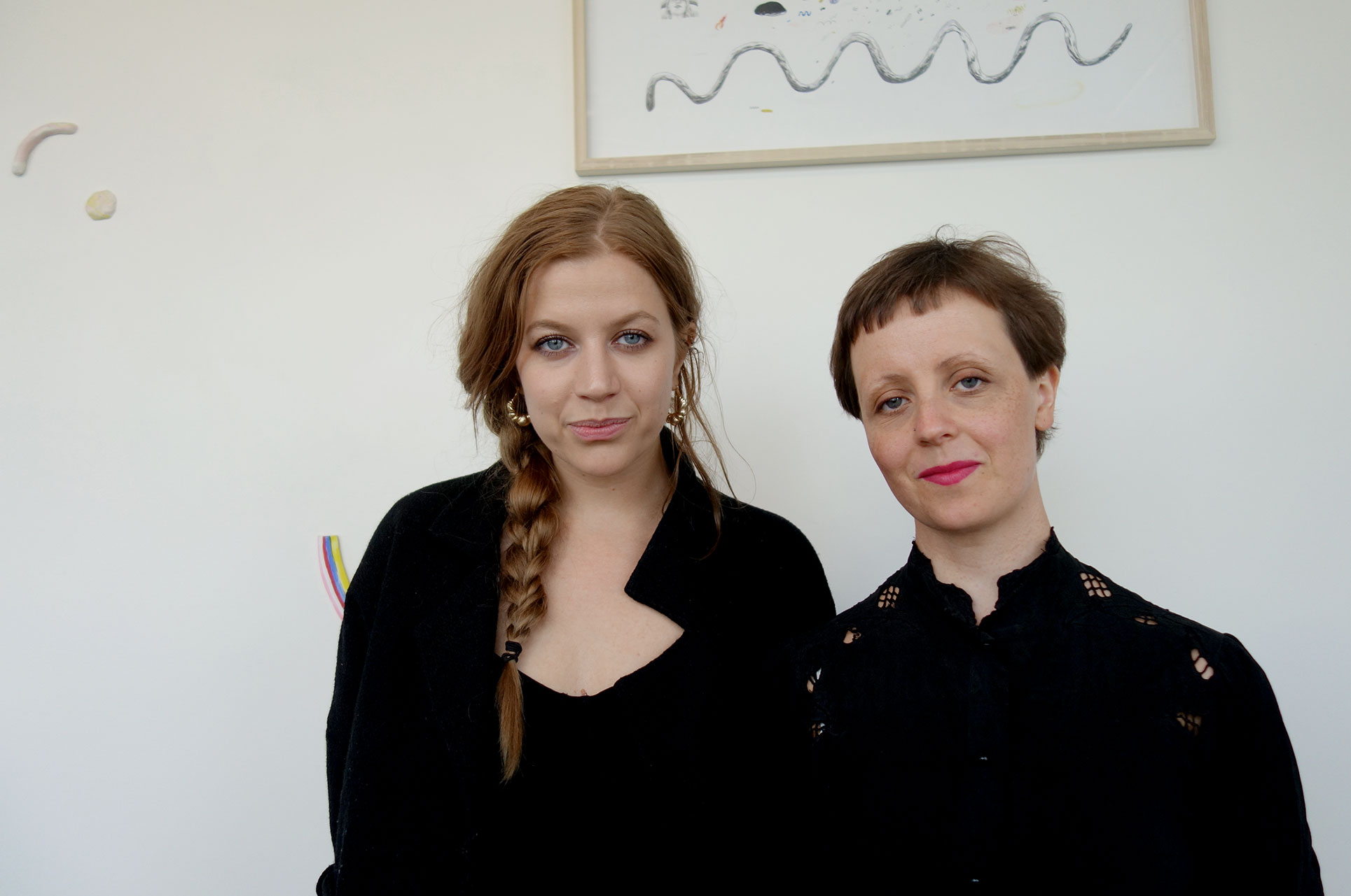
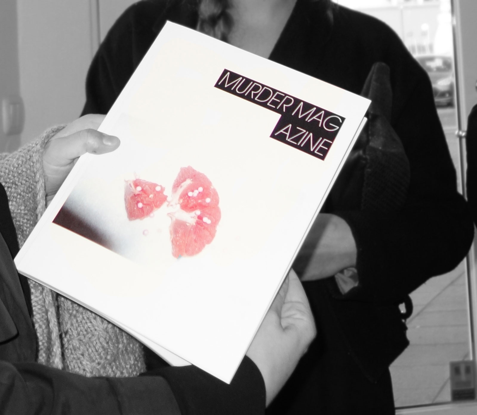
The first edition of Murder Magazine was published in May 2017. The editors/curators are writer/artist collaborators Bergrún Anna Hallsteinsdóttir and Síta Valrún. The magazine will have a different theme for each edition which will be published every three months. The theme for the first edition is ‘Body/Invisible’. I asked the creators a few questions about their new artistic platform.

Erin: When I Google ‘Murder Magazine Iceland’ the first things that come up are about the death of the young woman in Reykjavík earlier this year. I began to think about her story, walking home from a night out alone, and how it fit so well with the contents of this first issue of the magazine. It could almost be a tribute of sorts: the ultimate ‘Body/Invisible’. Did you come up with the name before or after this tragedy?

Síta/Bergrún: It’s interesting because the name came at the very start. At that point, we were in a very punk feminist vibe and the choice to use murder magazine came as part of that. The idea was that we wanted to murder the patriarchy 😀 since then we developed and de-labeled, cleaned up the aesthetic but we kept the original idea, we still want to murder the patriarchy but we want it to be an action, however small or large it ends up being. Not something we announce, but something we do. We did have a conversation about the murder here, earlier this year… it’s definitely sensitive. And we thought now when you described that it could even seem like a tribute, that this was very beautifully put. It’s not a tribute to her consciously but it’s a tribute to the invisibility of women and therefore, very much to those women who are murdered by men. The inclusion of ‘fanmail’ to Ana Mendieta is definitely a part of that tribute. In the end though, we are aiming to address the oppression of women, both by publishing primarily women, and also choosing material like “alchemy of pain”…well, all of it actually, where women are able to describe their experiences on their own terms and in their own words, or visually.
Erin: Can you tell me the brief story of how Murder Magazine came about? Your initial ideas, inspirations, visions, etc.

Síta/Bergrún: The story of how the project came about is kind of funny. We wanted to hold an exhibition together, so we would meet up to plan it. The conversation would somehow move in the direction of feminism and we would end up just sitting there, really pissed at the world and so we never managed to plan the exhibition. Then we had a break and came back to it with the idea of a newsletter instead of an exhibition, but then we were moved to make something tactile first, something which people could hold onto, and feel the weight of, so the idea of a zine which was more like a magazine in appearance and quality came about. Something where we could maintain our independent thought, but which would be a publication that people would value and take seriously. Not just a crazy rant, as it could be. Also, very important was to create something beautiful, a piece which people would enjoy owning, rather than being something that would end in the trash.

Erin: What can an artistic platform in the form of a magazine (or is it a zine?) offer that other mediums cannot?

Síta/Bergrún: The thing that attracted us to the form of the magazine is its compact nature which lends itself well to sharing. It’s moveable. Basically, it’s a Mary Poppins exhibition space, where people can put it in their bag but it can contain the whole world. We also liked the idea of being able to easily show art and poems we liked ourselves, without logistical difficulties. We made an open call, sent out fliers through friends in different countries; Mexico, Australia, New Zealand, America and various European countries and it was great to be able to make something so big and so small. We also contacted artists that we admired or if we thought that they would fit.

Erin: The theme for your first issue, ‘Body/Invisible’, brought about visuals and poems that are distinctly feminine… Do you have an outcome in mind when you decide your themes?

Síta/Bergrún: With the theme we did chose particular works so it was steered in that way. However, the majority of the work shown is the contributors’ interpretation of the theme ‘body/invisible’. This created an interesting outcome and was fun to curate with, working with knowns/unknowns. So yes, the feminine aspect could be due to many things. The fact that it is mainly women whose work we showed. The fact that we are women, choosing the work. The theme of body/invisible is perhaps also leading. The dichotomy of man/woman, mind/body leaves women very often connected to physicality and bodily-ness, so the connection of women to the body in a sense leads to this erasure… if that makes any sense? It does to us at least.

Erin: After being with the magazine in its entirety for the first time, I was struck by notions of pain and beauty. Do you think this came about from the theme of Body/Invisible as well?

Síta/Bergrún: Pain and beauty. We definitely see a clear red thread of pain and beauty running through it all. Which is in a sense also connected to that erasure. Like we were writing in the editor’s note, somehow we have to be hyper-visible, but not exist at the same time. Beauty is such a complex phenomenon, a much-used word which we feel entails so often making oneself vulnerable, in a myriad of ways. And that is painful.

Murder Magazine will be available in Mál og Menning, Listasafn Reykjavíkur-Hafnarhús, and Kiosk.

Erin Honeycutt


Photography: H.G.Ó.

T E X T

T E X T

T E X T

T E X T – Selected text-based works from the collection of Pétur Arason and Ragna Róbertsdóttir opened September 15th and will be on display at Listasafn Íslands until May 14th, 2017. The exhibition is the third in a trilogy curated by Birta Guðjónsdóttir each focusing on a specific medium in Pétur and Ragna’s collection. In 2010, Alternative Eye at Kjarvalstaðir presented photographic works from their collection. The chosen works dealt with concerns surrounding how photographs are being considered in contemporary art and what possible approaches will be pushed in the future. In 2011, DRAWINGFaster and Slower Lines at Listasafn Reykjavíkur borrowed its name from a work by Kristján Guðmundsson from 1976. This exhibition showcased the use of drawing in both two and three-dimensional works, expanding the definition of the term to include the material identity of a drawing and its role in connecting the body and architecture.

The collection of Pétur and Ragna has been growing for decades. The core of their private collection was accumulated when they invited artists to exhibit in their home gallery on Laugavegur in exchange for artwork between 1992 and 1997. The collection, in turn, played a huge role in connecting Icelandic artists with a broader art world and shaping the direction of contemporary art in Iceland. The exhibition text introduces the visitor to the overlapping realms at hand: “We are accustomed to seeing text and image as opposites, a dichotomy which has been transcended largely in contemporary art.“ The collected works have the effect of elevating notions of text beyond everyday usage. Text is shown as more than a conceptual tool, but a symbolist reality. Questions are brought up such as ‘how far can text be extended into other mediums such as sculpture and painting?’

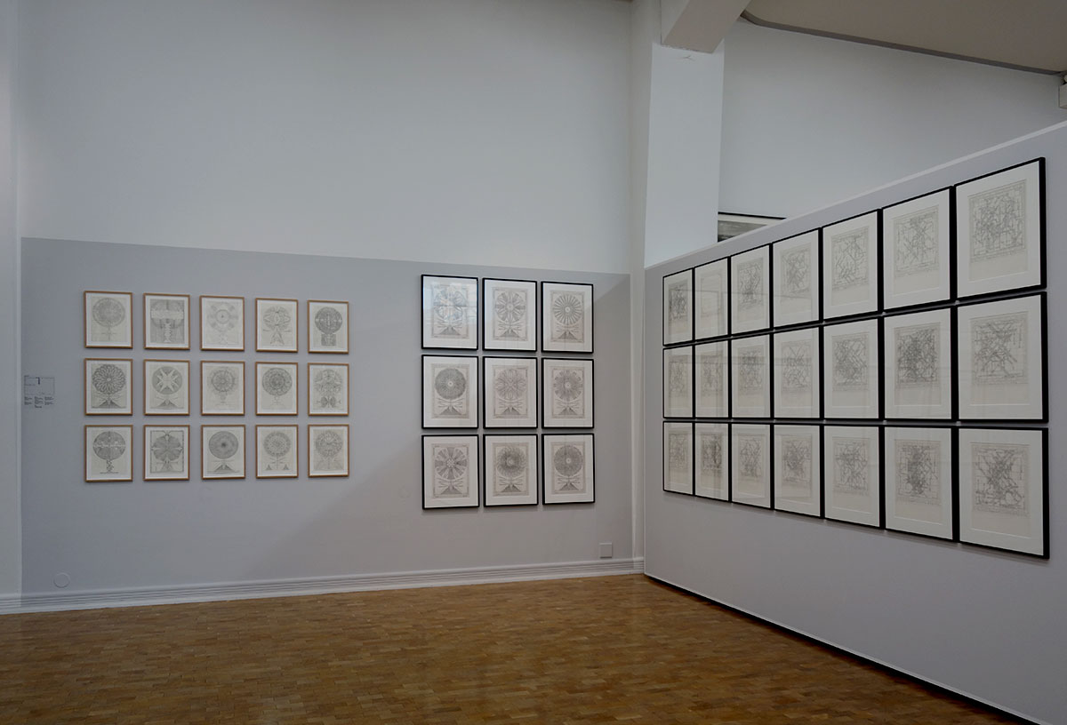
Take the works of Bjarni Þorarinsson (1947) whose mandala-like drawings Visirósir / Visío-Rose, (Wise Roses) 1990-2014 are based on a system of sounds in Icelandic and German. Each sound and its possible rhyme are part of a key to unlocking some truth in the language, a symbolism pointing to a beyond. Pronunciation is power and rhyme is the lifeline.

Bjarni Þorarinsson (1947) mandala-like drawings Visirósir / Visío-Rose, (Wise Roses) 1990-2014 and Bobby Fischer and Boris Spassky: The World Chess Championship Match, Reykjavík Iceland, July-August 1972

Bjarni Þorarinsson’s Bobby Fischer and Boris Spassky: The World Chess Championship Match, Reykjavík Iceland, July-August 1972, presents a map of the game laid out in a mechanical array of time; narrative is condensed into A to B. Bjarni’s works are based on the idea of a key that all other symbolizations are based on: the key to language. The language is a code in itself, which infuses both imagination and the structure of an entire worldview comprised of his symbolism made of words and drawings.

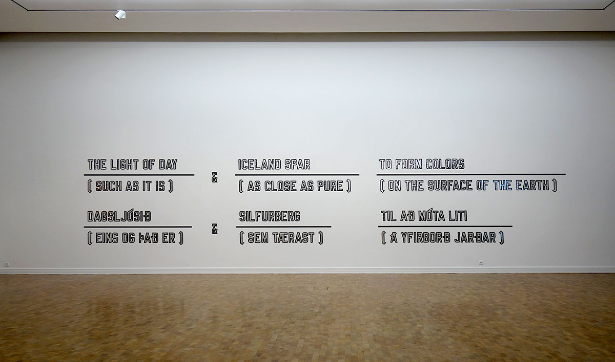
Lawrence Weiner (1942) creates his conversations with the interior architecture of the exhibition place in his mother-tongue (English) and in the native language of the place where he is exhibiting. Wiener’s work expands the definition of text to reflect its core identities and the way it is always connected to its source material be it graphite or plastic, but also to a pure conceptualism. In The Light of Day, 1998, Weiner lets the natural process taking place with earth materials unfold in the viewer’s imagination.

Lawrence Weiner, The Light of Day, 1998. 

A collection of postcards and telegrams from the artists to Peter and Ragna features a series from the notably reclusive, On Kawara (1933-2014). Telegrams sent to Pétur throughout 1996 carry the sole message:

I AM STILL ALIVE

This series actually began in 1969. The artist sent the same message to hundreds of friends and acquaintances in the art world. The telegram format is notably hands-off, as the artist has no control over the eventual aesthetic product, representing a certain attitude towards language and its uses.

Hanne Darboven’s (1941-2009) Welttheater ´79 covers the largest section of the exhibition with 366 framed images of theater scenes of her own design. Instead of using text, Darboven creates complex, hand-written number systems to represent the passing of time. This documentary language is like a mathematical equation, mapping huge swaths of history into a comprehensive visual form. She is known for her massive installations, and Welttheater ´79 is no exception. Darboven’s language, lacking a text per say, points towards the interrelationship between text and numbers instead.

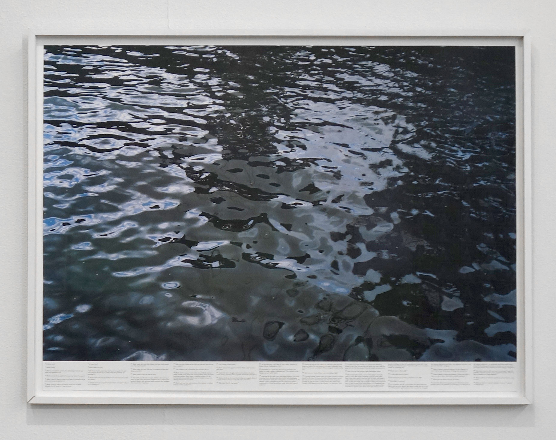
Roni Horn (1955) presents From Still Water (The River Thames For Example), 1996-2000. Her still photography from a larger series on the Thames, looks at how the river factors into the history and imagination of the world. She reads the river, as one who is navigating the currents would, and offers her findings as text to accompany the photograph of the river. For example:

  1. Black water is black milk.
  2. Is milk milk when it’s black?
  3. Isn’t transparency to water as whiteness is to milk?
  4. Moonlight or mercury?

Roni Horn, From Still Water (The River Thames For Example), 1996-2000.

Maps, codes, structures: language is as much about science as poetry, and perhaps it is what erupts from the overlay of text as visual concept that informs us about the abilities of text and text-based forms. Many of the artists who were involved in the advent of text-based works appearing in the visual arts in the 1960s have artwork in the exhibition including Joseph Kosuth, Yoko Ono, and On Kawara. One can see, and read, the way in which the decades following saw artists further expand the use of text-based art forms, in both very scientific and poetic statements. Although perhaps first intended, as with most new art forms, to either build-up or break-down current tendencies, the advent of text-based works served to free visual representation in the imagination of the viewer. An unlimited way forward with language was created- and the direction was towards conceptualism.

The exhibition includes works by: Birgir Andrésson, Robert Barry, Joseph Beuys, Thomas A. ClarkHanne Darboven, Tacita Dean, Steingrímur Eyfjörð, Robert Filliou, Ian Hamilton, Finlay, Hreinn Friðfinnsson, Hamish Fulton, Douglas Gordon, Franz Graf, Kristján Guðmundsson, Sigurður Guðmundsson, Jón Laxdal HalldórssonJenny Holzer, Roni Horn, Donald Judd, On Kawara, Joseph Kosuth, Mark Lombardi, Richard Long, Max Neuhaus, Yoko Ono, Roman Opalka, Richard Prince, Karin Sander, Ben Vautier, Ryszard Wasco, Lawrence Weiner, Bjarni H. Þórarinsson.

Erin Honeycutt


Featured image: Lawrence Wiener

Photography: H.Ó.

The Tragicomedies of Guillaume Bijl

The Tragicomedies of Guillaume Bijl

The Tragicomedies of Guillaume Bijl

The Politician = a Transformation – Installation by the Belgian artist Guillaume Bijl was on view at Mengi from March 31st to April 1st, 2017.

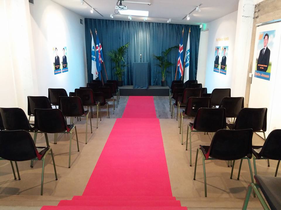
In many ways, Guillaume Bijl (1946) is still a painter, which was his initial focus in the 1960’s, only now he paints still-lives in the three-dimensions of an installation. The Politician is a ‘Transformation-Installation,’ or ‘a reality within non-reality,’ one of the categorizations in which Bijl places his works based on their function within the context of the exhibition space. In The Politician, the exhibition space is transformed into a hall introducing a new politician, Stefán Jónsson.

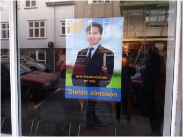
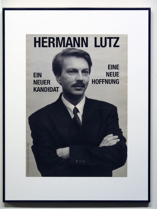
This neverbeforeseen candidate in Icelandic politics could be seen on a poster offering new hope (ný von) to visitors of the event. The chairs aligning either side of a red carpet led to a stage on which a podium complete with a microphone and a glass of water stood against a draping gray curtain. Nondescript ferns and Icelandic National flags dappled the scene with the precision and detail of a film-set. The venue became defined by this political atmosphere, asking us to reflect on our beliefs in the function of the whole political system. Bijl shows us how the display for a politician is a consumer setup as well. This can be said for many of his Transformation-Installations which place the visitor in the consumer or service-oriented scenario in which the usual choreography is nowhere to be seen. Instead, it is as though one is visiting the backdrop of daily life to inspect the reality of it.

This neverbeforeseen candidate in Icelandic politics could be seen on a poster offering new hope. Image: Mengi.

Bijl’s ‘Art Liquidation Project’ began in 1979 when he wrote a fictional pamphlet stating that the government had deemed art irrelevant for society and therefore spaces devoted to the arts would now be turned into places more blatantly beneficial to society. The first in this series of projects was Driving School Z, set up in Ruimte Z Gallery in Antwerp, Belgium. This driving school set-up was so meticulously staged that passers-by would enter and ask about driving lessons. Bijl’s perfect imitation of reality was now of benefit to society, and the question of the role of art in society was lived out in the installation and the many series to follow. Other Transformation-Installations have included:

  • a staircase shop
  • a taxi stand
  • a lost and found center
  • an army information center
  • an auction house
  • a conference room
  • a locker room
  • an atomic bomb shelter
  • a caravan show
  • a terracotta shop
  • a laundry
  • a garden décor shop
  • an interphone center
  • a discount mattress store
  • a mirror stand
  • a shell stand
  • a wig shop
  • a dog salon
  • an oriental garden shop
  • an airport lobby
  • a formalwear rental shop
  • Miss Hamburg 1988
  • A disco
  • A menswear shop
  • A fashion shop
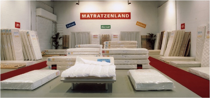
A Transformation-Installation, Matrassenland, 2003, Kunsthalle Munster. Image: guillaumebijl.be

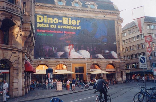
A Situation-Installation, Dino Eier, 2001, “Frontside” Project, Basel. Image: guillaumebijl.be
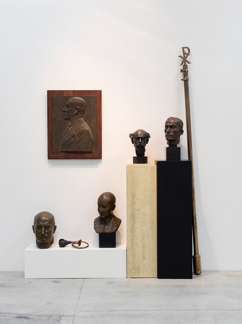
Composition Trouvée, 1992, Galleri Nicolai Wallner, 
Copenhagen. Image: guillaumebijl.be

Sorry, 1987, Collection S.M.A.K. Ghent. 
Image: guillaumebijl.be

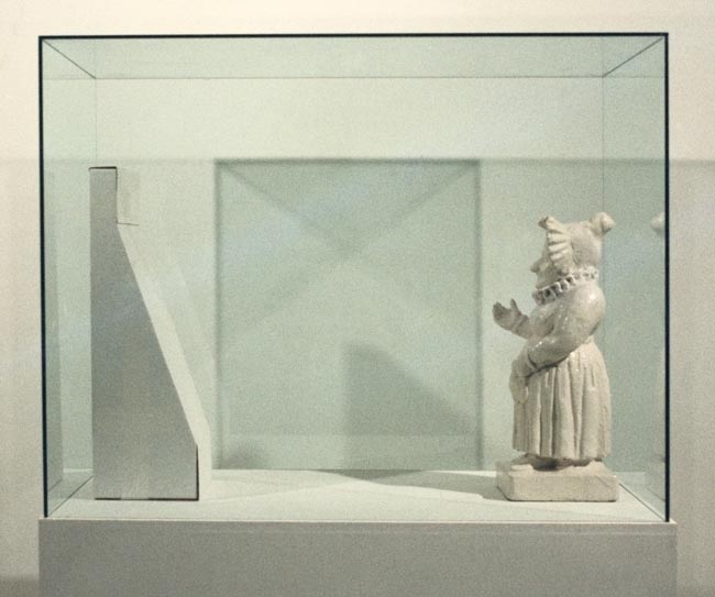
Bijl also categorizes his works as ‘Situation-Installation: a non-reality within reality.’ In this instance the transformation is fictive, such as: a fake horse in a horse trailer, a poster selling dinosaur eggs, a mediocre sculpture garden.

Bijl also categorizes his works as ‘Situation-Installation: a non-reality within reality.’ In this instance the transformation is fictive, such as: a fake horse in a horse trailer, a poster selling dinosaur eggs, a mediocre sculpture garden.

Bijl’s ‘Compositions,’ are an archaeological still-life, similar to a ready-made but using objects to replicate parts of the Transformation-Installations. These have appeared as Chinese supermarket décor, a collection of marble sculptures, fragments of an antique shop, and fragments of other large-scale installations.

Bijl’s fragments of reality taken into the undefined space of the art institution function as a sort of gigantic ready-made. His works, commenting on the relationship between art publics and wider society, operate like a huge cultural therapy session in which it is revealed that all are actors on a stage. In a quote from 1980, Bijl described his efforts in the Transformation-Installations as a visualization of “…social determinacy and mass conditioning in a tragicomic way (1).” Bijl shows civilization in its current state; the installations become tragicomic mirrors of society using the hyper-real as an ironic tool. His works show how consumer capitalism is a concept in itself by letting the viewer step back and observe their own role in the functioning of the system and in its accompanying social rituals. Instead of participating in the set-up, the visitor is just that, a visitor to his own reality.

I asked Bijl if there was something specific about Iceland that made him decide to have a political installation. He responded that there was no special reason, although he has introduced new politicians in a similar manner in Germany in 1988 and in Holland and Belgium in 2016.

Hermann Lutz, 1988, Kunstverein Kassel.
Image: guillaumebijl.be

I also asked Bijl how he perceived the trajectory of material culture as things become more digitized. He responded that he shows the “archaeology of this civilization already in the present and in the wrong places… in art spaces and installations/decors; I’m a witness of this/our time,” he said, “and my archaeologies will only seem more abstract in the future.”

Others have also made a note of Bijl’s work and its connection to an archaeology. In terms of preserving history with the elements of the present, this is not a new notion in 20th-century art. Many artists have experimented with the transcendence of their own time and place by speculating on the future. Making a claim to present culture by using it in artwork allows an artist to make decisions about what is valuable and relevant for our successors. As well, the act of working with history to reinvent the story being told about the past can work in the same way- just as Bijl’s works are a statement to his being witness in these times, so can artists be a witness to taking immediate action against what has been written as history. For example, Marcel Duchamp’s ready-mades went against centuries of ideas about artistic creation and the role of aesthetics.

„An ordinary object,“ Duchamp famously stated, “could be elevated to the dignity of a work of art by the mere choice of an artist.” A bicycle wheel, a bottle rack, a urinal- the utilitarian objects of man, future archaeologists will ponder, were suddenly taken out of utilization and placed as ritual objects in the early 20th century.

The strategy of rewriting the past within the present can be seen in works by Ai Wei Wei as well, in Han Dynasty Urn with Coca-Cola Logo from 1994, for example. If the future past lies within the present, the role of historians in the future is to differentiate between states of remembering or else rewrite the historical past altogether. The question „What is our heritage for the future?“ is in the hands of contemporary artists who have the power to make value judgments about what should remain of the present. Bijl’s work is in some ways a speculation on how the present will appear to future generations. How will it be interpreted and what kinds of conversations will it bring up? Will the tragicomic element still exist in 100 years? A completely different set of questions is in which medium this will be preserved and viewed in the future, the photographs digitized and stored on the vast Internet archive along with this article.

Bijl is telling a story about our history through an extraction from the present reality by placing the present reality in a museum of sorts, a still-life without function or interaction. To step into the art space is to take a journey into the future to view the present on display.

Erin Honeycutt

The Alchemy of Color- Jeanine Cohen at Hverfisgallerí

The Alchemy of Color- Jeanine Cohen at Hverfisgallerí

The Alchemy of Color- Jeanine Cohen at Hverfisgallerí

The Space Between by the Belgian artist Jeanine Cohen is now on view at Hverfisgallerí from March 17th to April 29th.

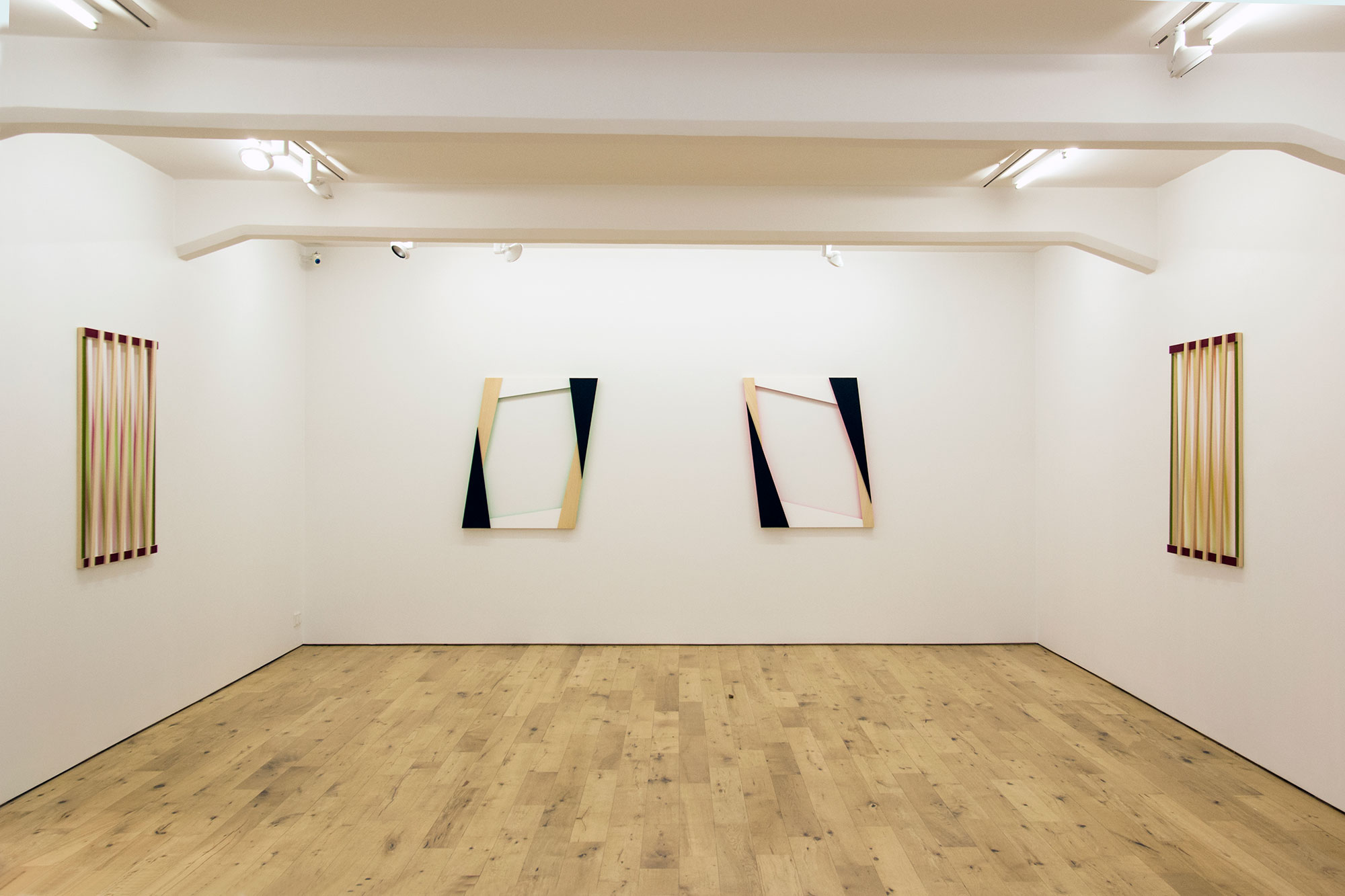
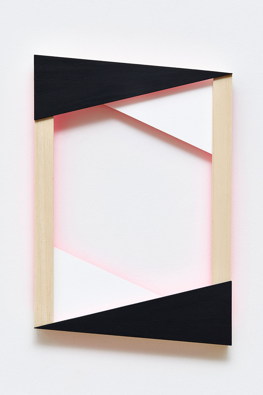
Jeanine Cohen (1951- ) is foremost a painter. In her work, she carries the painting tradition into an architectural frontier in which the exhibition space takes part in the referencing of a frame. At Hverfisgallerí, Cohen presents two new series, Diagonal and Angles, in which she continues exploring the ways in which a frame can be referenced without a canvas, revolving around the parameters of paint application, color and light interaction, and the expansion of the pictorial surface. Like miniature architectural models, the works contain a world of atmospheric possibilities in themselves. Cohen has found a way to animate these worlds using the movement of the viewer to bring about a shifting of interplays between light and color within the space.

Diagonal and Angles speaks of accounts of subjectivity in architecture that tell the simple story about interiors and exteriors. In the form of a painting, the folded multidimensional framework tells us that what is interior is nothing more than a fold of the exterior. As in Deleuze’s ‘fold’ which he uses to expound on his concepts of the possibilities of producing subjectivity, the interplay of light and color guided by the referential frame can be seen as a topology of these meeting places called ‘folds.’

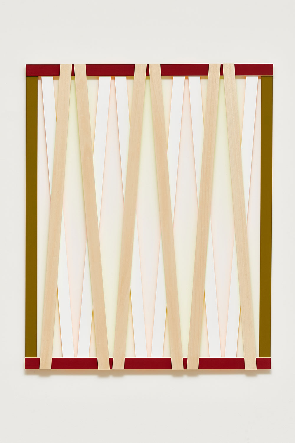
Jeanine Cohen, Diagonal N°3, 2017.

In the Diagonal series, Cohen pairs the dense colors of the outer edges, an olive green and a wine red, with fluorescent hues of the same tones, which are painted on the underside of wooden panels. These fluorescent hues reflect on another layer of white panels as well as on the gallery wall. A shadow play emerges, although the shadow is made of light.

There is a prescience to the electronic image in the works, related in the alchemy of colors that hang in a balance of appearing and disappearing, in the red and green hues that were also the two-color system used in early Technicolor processes, and in the way the panels criss-cross as in the intersecting lines which make up an electronic image plane. The hues reverberate from the frame, making the image expand and contract. In the Angles series, the fluorescence shifts against the vacuum created by the black and white.

Jeanine Cohen, Angle N°5, 2017.

If perspective is the guiding force of painting, then the narrative focus provided by perspective can be seen in Cohen’s work to be telling a story about the history of the pictorial surface of the painting and where it collides with architecture. The story seems to tell us that we are now beyond the vanishing point; it sits somewhere behind us as we experience the shadow of fluorescent light on a canvas that doesn’t exist. Cohen collapses the narrative of perspective while giving the works their own glow from within, similar to the confrontation between temporal and spiritual authority in a Renaissance painting.

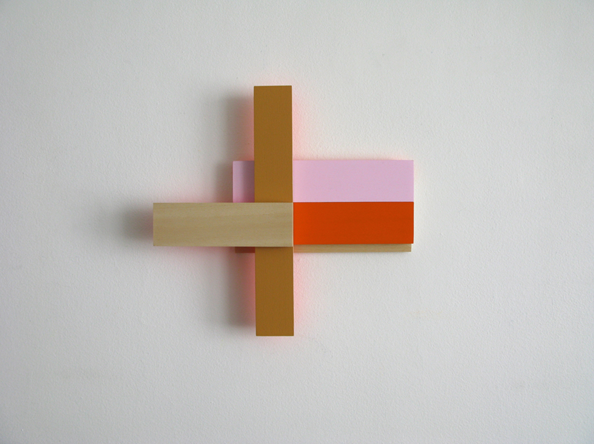
Winter Series N°1, 2013

A previous piece from 2013 also exhibited at Hverfisgallerí shows another organization of structural planes in which to consider the frame. In Winter Series No. 1, a cross-shaped structure emanates a backlit glow of pink neon amongst a further interplay of shadow and angle and denser color hues.

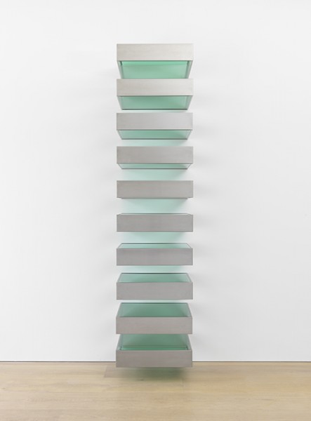
Donald Judd, Untitled (Bernstein 89-1), 1989, installation view. Photo: David Zwirner Gallery.

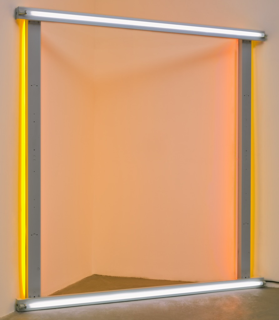
Dan Flavin (1933-1996), the American minimalist sculptor and installation artist used industrial neon lighting tubes to bring together color and light, while Cohen organically goes about electrifying her work. Using neon light tubes and metal fixtures, Flavin brings an extra dimension to the conversation between light and color in the exhibition space. His neon installations initiated focus on the orientation of the viewer’s experience of the work.

Cohen’s elucidation on the conversational nature of color brings to mind other artists whose work with color and light take part in a similar discussion. Donald Judd (1928-1994) American sculptor also worked towards an absolving of interactions between space, light and color. In his wall stacks using colored Plexiglas and steel from the late 1980s, light is filtered in an alteration of presentations as the viewer interacts with the exhibition. The simple relation of objects reminds the viewer of the natural properties of light and color.

Dan Flavin, untitled (to the “innovator” of Wheeling Peachblow), 1966-1968. Photo: MOMA.

These earlier contemporaries of Cohen’s explored the parameters of their shared artistic elements in innovative ways which are relevant here only to highlight the contribution Cohen has made to existing fields. The structures holding these works look like canvas stretchers without canvas, or architectural drawing boards, but not a work pictorially displayed in any traditional sense. Cohen bridges the gap between painting and architecture, creating a fluid vanishing point where light and color are hung impossibly on shadow and form. Like a prescience to time-based arts, the works’ infrastructure moves between an image of construction and destruction, in a disappearing act with the wall, the atmospheric colors hyperreal in the way that they are already closer to a memory.

Höfundur: Erin Honeycutt


Links:

http://www.jeaninecohen.net/

Resources:

http://www.davidzwirner.com/

Deleuze, Gilles. The Fold: Leibniz and the Baroque. Translated by Tom Conley, The Athlone Press, 1993.

A ‘site-specific play’ by Anne Rombach

A ‘site-specific play’ by Anne Rombach

A ‘site-specific play’ by Anne Rombach

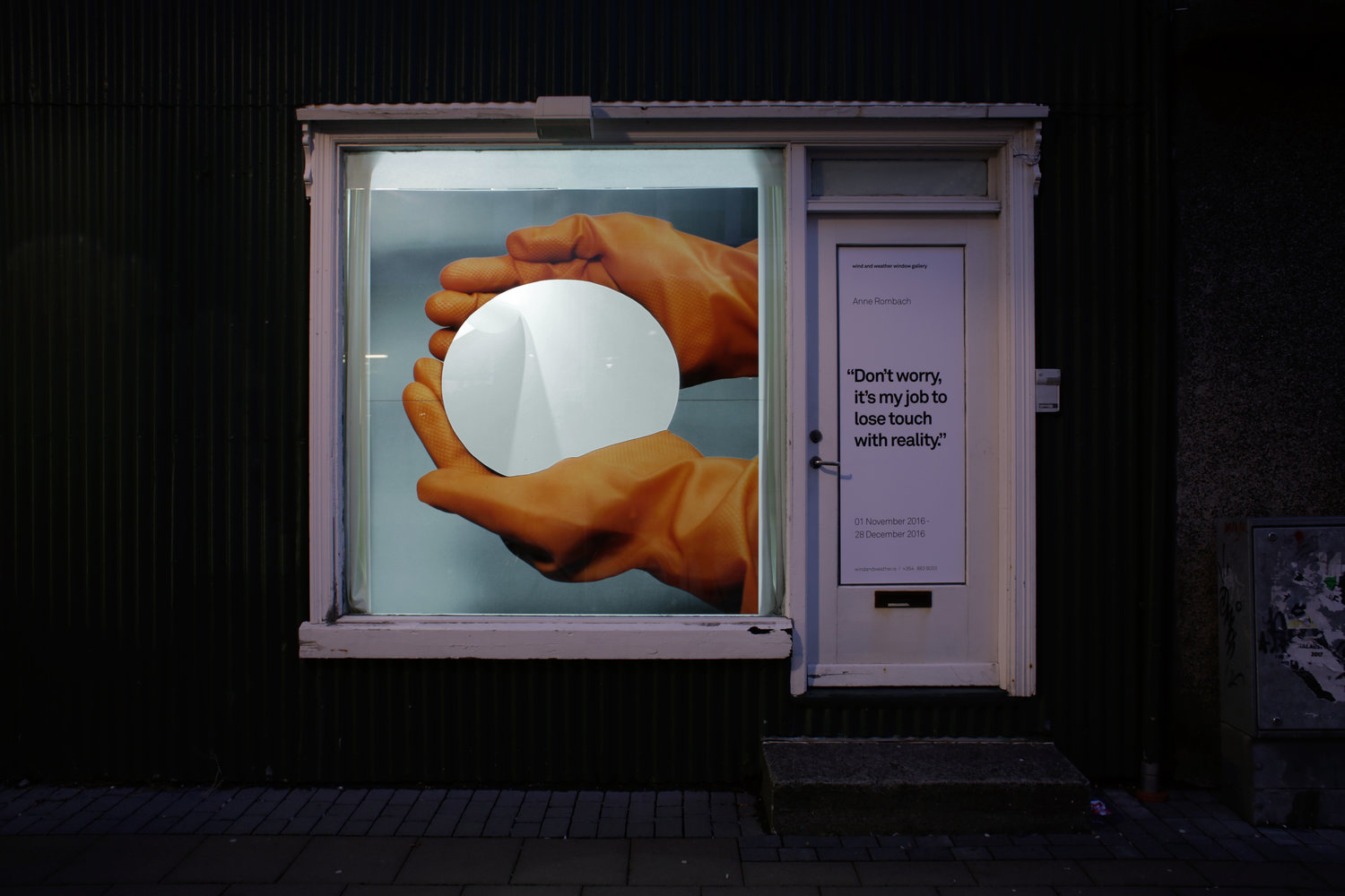
Now on display for the months of November and December at Wind and Weather Window Gallery (Hverfisgata 37) is a ‘site-specific play’ by Anne Rombach who graduated earlier this year from the MA in Fine Art at Listaháskoli Íslands. “Don’t worry, it’s my job to lose touch with reality” asks questions about the role of the artist in society with the consoling yet flippant title suggesting the multitude of realities to advocate.

The potency of the self-titled ‘site-specific play’ is in turning the quotidian reality on its head. All of the events that have taken place both locally and on the world stage since the opening of Anne’s exhibition seem to play into her reality equation. Perhaps as the lines between the ‘everyday’ reality and the reality of the media are blurred, it is the role of artists to remind people how to differentiate and find the real in a sea of imitations and simulations. In the window, a pair of orange rubber gloved hands cups an empty space that reveals a curious fold of white paper in the exhibition space behind the window. Is the artist’s job like that of a scientist, to bring minute, mysterious specimens up to the light of the world whether that be infinite nothingness or the reflection of a passersby on the street? In this way, the exhibition becomes the ‘play’ in which we participate everyday.

The artist remarks that she was immediately drawn to the found image and its contradictory nature: “…orange gloves holding something very carefully, this something seems to be very precious but dangerous at the same time. They want to hold and show it, but they also have to protect themselves, their skin, from it. Soon I lost interest in what they were actually holding; it became a blank page to me. I was drawn to the wonderfully paradox gesture of the two hands covered in gloves. I found more pictures of that kind and cut out whatever they were holding. Even though the ‘main actor’ vanished operated by my amputation, it felt like they are holding something much bigger.”

“In the window gallery I show the moment of the vanishing blank page,” she continues. “You see two hands covered with orange gloves palming a hole through which you can look inside. In the space you see something hanging there. It is the cutout piece that is disappearing through the wall, escaping maybe. It is caught in that transitional moment, a bit like a photograph. I extend the moment of a fluent passage into a 2-month installation.” This transitional moment is where the multitude of realities touch in Anne’s ‘play’. According to the self-talk that inspired the title, touching reality and losing touch with reality are part of the same act.

The exhibition will close at the end of December 2016.

UA-76827897-1