Amalia Pica  – Set Theory & the representation of communication

Amalia Pica – Set Theory & the representation of communication

Amalia Pica – Set Theory & the representation of communication

Amalia Pica’s solo exhibition — A un brazo de distancia — opened at NC-Arte (Bogota) this April. With works almost exclusively from this year (2017), the exhibition centres around the cognitive processes and social conformities of animals. Specifically in relation to the artist’s observation of baboons when in residence at the Gaskaka Primate Project in Nigeria.

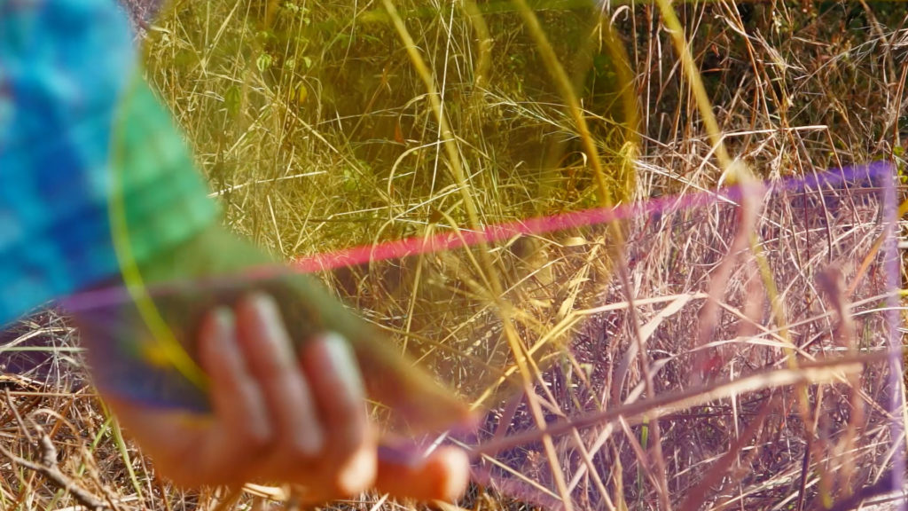
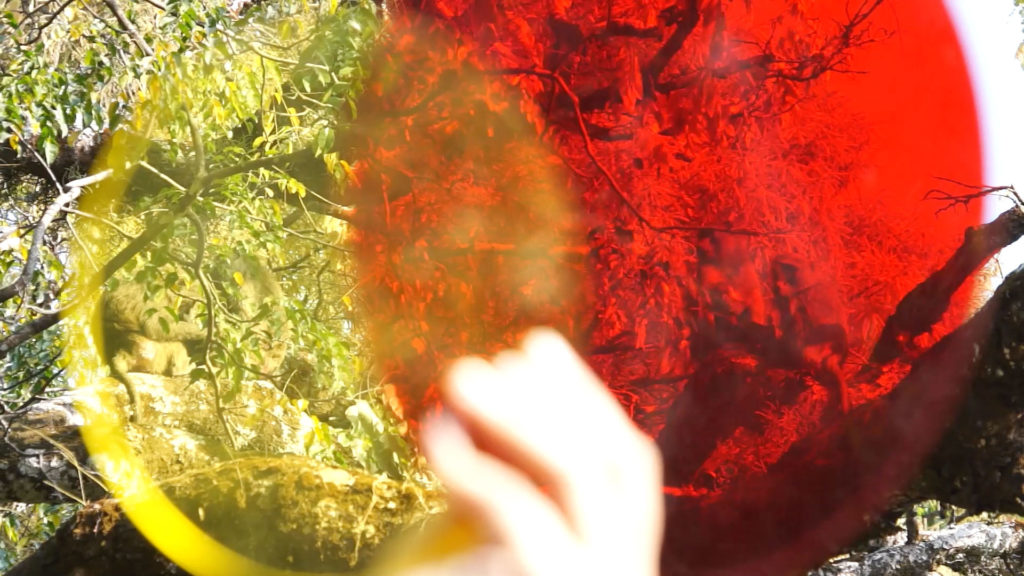
A un brazo de distancia is also the name of the centrepiece of the exhibition. It is a 45-minute long video, co-authored by Rafael Ortega that consists of footage resembling the raw material of a nature documentary taken at Gashaka Gumti National Park (NG). On top of which appears a series of transparent, coloured forms that reach into the middle of the frame. They meet and overlap on those occasions when more than one shape had appeared in the frame. Which in view of Amalia Pica’s earlier work, may be understood to form a visual reference to set theory.

As a short introduction to which, set theory basically describes a group of things as if they were one thing, i.e. a set. Each set is therefore conceived as an abstraction to make it easier to explore the relationship that one group may have with another group. It is a branch of mathematics that holds a natural interest for artist because of its ability to describe what are sometimes complex relationships through visual means. Of which Venn diagrams occupy an iconic example. Like those familiar images of interlocking circles, one may for example represent animals that produce milk (mammals) and another animals that lay eggs (birds). When these two circles intersect, they form an ellipse between them. In this example it would be inhabited by a platypus — it being the only animal to both lays eggs and produce milk.

Amalia Pica’s most emblematic work, Venn Diagrams (under the Spotlight) from 2011, draws the outlines of such a proposition. The installation consists of two spotlights, coloured filters, and a motion detector. One of which is lit when a person approaches the piece, while the second is lit only when more bodies occupy that same space. These lights form pools of colour on the facing wall. So that when both are activated, they draw out the silhouette of two interlocking circles. Within which a white ellipse appears at the location of their intersection because their two colours had intermingled.

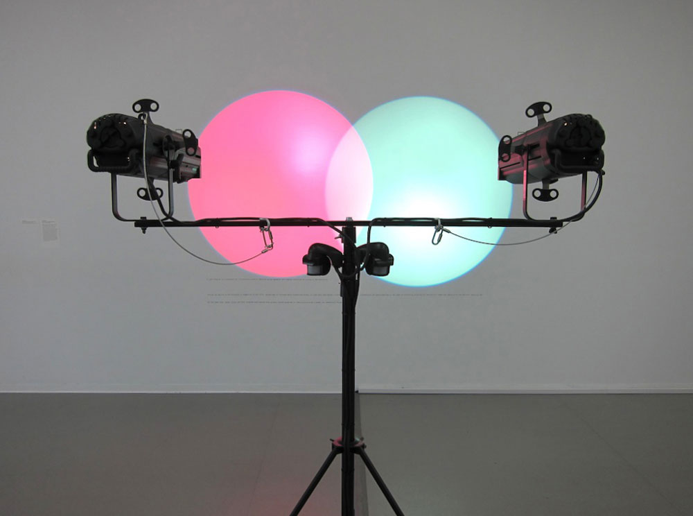
The conceptual basis for this installation forming the outlines of a Venn diagram is based on a historical anecdote: Venn diagrams had not been taught to Argentinian school children during the „Dirty War“ (1974-1983). The artist speculates that this prohibition was due to fact that in this era of explicit political repression, such graphs could be understood as metaphors for the interaction of people. Which from the perspective of a dictatorship, would inevitably lead to a conspiracy against it. Using this reference to 20th century history, these circles of light draw a theoretical proposition. One that dictates that the presence of bodies may be equated to mathematic diagrams. An example of the way this works is how operations within sets approximate to subtraction, addition or multiplication. In linguistic terms these operations may function as „and“ or „or“ — meaning that two things can either be added together, or that one must choose between them. When translated onto physical bodies, it means that their mere presence may equate to addition, while subtraction may equate to an accentuation of differences. By connotation, the analogy may be extended to include multiplication, which may apply to groups that had come together out of collective interest so as to amplify their influence in the world.

The next work to make explicit use of S-set theory is A ∩ B ∩ C (Line) from 2013. Like Venn Diagrams (under the Spotlight), it makes a neat nod towards participatory art by having the work be activated by human intervention. The installation consists of coloured shapes that had been cut from plexiglas and placed around the walls of the exhibition space in a quasi-casual arrangement. Performers interact with the piece by first choosing one of these shapes and then arranging themselves, three at a time, in a line. By standing in close proximity to their neighbour, the objects they hold are able to intersect with that of their neighbours’.

The resulting series of intersecting shapes, can be understood to convey the same conceptual associations that exist in Venn Diagrams (under the Spotlight). Yet to the degree that the audience can no longer influence those actions that draws out its form, the performance can be seen as an inversion of the earlier installation. With the spectator now being passive in front of loosely choreographed set of actions, and to the degree it induces the suspended belief in having witnessed an authentic event, it evokes the logic of the spectacle. This connotation of the spectacle may even be considered problematic in view of original context in which set theory originally appears in Amalia Pica’s work as an implicit critique of the repression of free speech. Which is problematic because the spectacle too evokes an uneasy relationship with modern-day technologies of coercion.

Taken to its most blatant extreme, spectacles are implicit to propaganda carried out by long-lived regimes such as North Korea. Whereas propaganda, within modern-day systems of global capitalism, may lie in the banality of commercials. While they are usually aimed at promoting specific products, it is to the extent that mass entertainment relies on commercials to finance its production, that the contemporary spectacle may be considered propaganda for consumer behaviour in general. Which has been theorized to be effective precisely to the degree that it induces passivity in its audience. (Guy Debord, The Society of the Spectacle) Yet to make this critique of the work is to assume that by referencing political repression in the past, the artist had intended to critique a contemporary order within later pieces.

Not only is this assumption the result of bad logic, it also overlooks how the formal qualities of work deals with the phenomenology of communication. Not by producing overt statements, but through the self-reflexivity of form that aesthetics implies. Specifically it is by creating conceptual compositions that draw parallels between math and physical existence, that they are able to draw the outlines of a more profound truth about communication. Namely how each proposition also describes the formal condition by which communication may happen. 

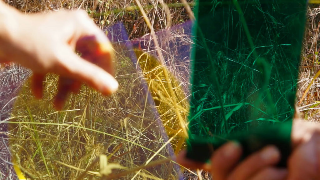
A un brazo de distancia, meaning „At Arm’s Length“, is the third work to make explicit use of the reference to Venn diagrams. It follows as a natural continuation of the artist’s contemplation about the communication of information. Now wondering how its it may be condensed into its most basic principles, Amalia Pica has gone on to consider communication from its pre-human origins — which following scientific reasoning, we assume to resemble the communication of primates. The film consists of idyllic scenes of baboons in their natural habitat, with transparent forms superimposed onto those images. Ranging from one to three, these coloured forms waver a bit as they reach into the frame and evoke the presence of the hand.

Like editing in reverse, the footage takes on the colour of these shapes, not in post-production, but by holding what are effectively filters, directly in front of the camera. At first, the fact of these colours shapes being superimposed onto a moving image would seem to perform a simple operation of addition. It is only through a rhythmic repetition of the same action, that it becomes clear that the appearance of colour fields coincides with the presence of baboons. Thereby evoking the logical operation of Venn Diagrams (under the Spotlight), where the presence of multiple bodies had been established to be the precondition by which the intersection of shapes may happen.

In emphasising the social structures of animals as a theme of the exhibition, the logic of A un brazo de distancia points to an analogy between shapes that draw out diagrams and that of bodies that gather to form community. In the same way that we don’t really know if one baboon had said something to another baboon, we can assume that like humans, their presence may convey information. A thing as simple as body language may convey the internal landscape of one person to another. Implying once again how mutual coexistence produces meaning, just like symbols coexist in the same mathematical proposition do. And while we tend to think of propositions as a way to convey information, the nice thing about them is that like aesthetics, they are true to the degree that they are correctly formulated. – A un brazo de distancia was open until June 24. 2017.

 Geirþrúður Finnbogadóttir Hjörvar


Images: courtesy of NC-Arte (Bogota)

Venns Diagram: Solomon R. Guggenheim Museum, New York Guggenheim UBS MAP Purchase Fund, 2014

Featured image with article: Still from the film A un brazo de distancia.

About the artist: en.wikipedia.org/wiki/Amalia_Pica


Mapping Time both Eternal and Material with Gretar Reynisson

Mapping Time both Eternal and Material with Gretar Reynisson

Mapping Time both Eternal and Material with Gretar Reynisson

Although possessing a material reality, time exists without needing to be represented nor is its representation necessary in the experience of time. With time-based artwork such as that by Gretar Reynisson, the experience of time is visualized into a form on the minute line between the personal and the universal. The experience of time is given aesthetic effect as ‘the time of art’ itself. It is not comparable to the time of the museum’s opening hours, or the duration of a film, or the time it takes to get from one place to another, although it can contain all of these elements. 

Space and time, as the foundations of human perception, fragment and perform a distortional effect on the senses depending on how it is framed. Time appears as linear with the past disappearing and the future on the horizon, with the present as a stepping stone balanced somewhere in between. This is the place, the moment, and the vicinity in which Gretar Reynisson expands his timeline, creating a ripple in the timeline of those who come into contact with his work. These time-based works create a ripple all their own, affecting the ‘time of art’ itself.

By measuring time with the precision of its material reality, he has expanded the present moment by mapping time with ritual and material, but it is not the ritual that would require any incantation, as it is the expanded moment of daily life where it is lived every day in the very physicality of the body and its processes that the real transformation from one moment in time to the next is charted. Something in the experience of this mapping of time automatically gathers a momentum all its own, and it is part of the map that you don’t have to see to know that time will indeed continue without this mapping. This knowledge overlaps with the everyday map of time, and you see and know that time will continue into eternity and we are tiny blips on that eternal map.

20 40 60

At Neskirkja from April 2nd to June 25th, 2017, the artist presents the exhibition 20 40 60, celebrating the 60th birthday of the artist as well as the 60th birthday of the church itself. The title comes from a photograph the artist took 40 years ago at age 20, of his hand next to the impression his hand has made in mud, which the artist restaged earlier in 2017. Both photographs can be seen in the exhibition, each referencing the line from Genesis 3:19- By the sweat of your brow you will eat your food until you return to the ground since from it you were taken; for dust you are and to dust you will return.

During a performance accompanying the exhibition, guests were invited to make their own fingerprint impressions with mud on the walls inside the church’s gallery- 500 to be exact. This corresponds to the 500 years that have passed since Martin Luther nailed his Ninety-Five Theses to the door of the castle church in Wittenberg Germany, which marked the beginning of the Reformation and changed the course of history. At Hallgrimskírkja, the artist has filled the vestibule of the church with 500 nails each with a corresponding tag for the years between 1517 and 2017. This exhibition, titled 501 Nails is on exhibit from May 21st to August 21st, 2017.

On the exhibition walls at Neskirkja, the fingerprints are like constellations with the tiny crevices of individual lines inside each marking visible. On the opposite wall, you see the white towels that each person used to clean the excess mud from their fingers as another kind of memento mori of the body in its interaction with surfaces and materials. With these impressions, it is as though the material evidence is what holds the memory of time between realms. The material tells us everything we know and brings the viewer or participant into the epic story in which we all take part. There is something reminiscent of a wall of prayer where people come to meditate in the mud fingerprints. With the ancient text reminding us that we shall return to this earthly material, the span of time between becomes impressionable- as the fingerprints pressing on the walls of the church are attempting to weigh the structure itself and what it stands for against the existential weight of time that we face every day.

Like the still-life painting theme memento mori which began as early as the 16th century and was most renowned in Northern Europe, the mud fingerprints are one in the same as the objects so often depicted: rotting fruit and vegetables, withering flowers, skulls, hourglasses, smoke, bubbles, and usually a surface with the glint of a reflection of the artist themselves. These objects symbolized the ephemeral quality of life in its fleeting nature, a precursor to time-based artworks. The artist considers the quality of time as a subjective, interactive entity in which the practice of image-making is tandem with learning how to visualize time. The phenomenologist Maurice Merleau-Ponty described the act of perceiving as an act akin to drawing: “definite qualities only draw themselves in the confused mass of our impressions if it is put in perspective and coordinated by space.”[1] In this way, Gretar Reynisson’s mapping of time with material objects in his everyday life brings order to this massive array of perceptions shaped and gathered by time and space. He maps the coordinates as a meditation on being present in the everyday.

More About the Artist’s Previous Time-Based Works

1,461 Days

Twenty years ago, Gretar Reynisson began a series of works in which time and the objects making up the artist’s everyday life were interwoven. Work produced in this manner was exhibited at Kjarvalstaðir in 2001 under the title 1,461 Dagur (1,461 Days) corresponding to the time period from January 1, 1997 to December 31, 2000. In 1,461 Dagur, the artist methodically worked over four years, with each year documented according to, in chronological order: days, weeks, months, and finally, a year.

In 1997, each day was recorded as a graphite drawing onto a 12 x 12 cm wood plate and corresponding to this were face rubbings made by the excess graphite dust created by each day’s drawing. In 1998, weeks were recorded as graphite drawings onto 21 x 21 cm wood plates. These more detailed works gave further inquiry into the weight of time and how it shapes our actions. Accompanying each day in 1998, the artist also baked a small loaf of bread, a religious allusion that straddles both eternal and physical time. In 1999, a 31 x 31 cm wood plate is created for each month of the year as a graphite drawing. The graphite mandalas of subtle circular impressions pull the viewer into the spiral of existential time. Corresponding to the plates are coffee diaries, one with a coffee stain for each day from the artist’s daily coffee cup. The year 2000 was measured by objects left behind after their initial purpose expired. Taken as a whole, the year is exhibited as 52 bath towels, one from each week of the year, with the accumulated bodily impressions of the artist in the object. The artist presents a 100 x 100 cm wood plate for the year as a graphite drawing showing repeating undulating spirals, like the zoomed in reflected material from a painting by a Dutch master, an esoteric reflecting glass held in the palm of a child.

Decade

Gretar was honorary artist at Sequences festival in April 2013, at which his work titled Áratugur (Decade) was exhibited, involving works from 2001 to 2010. Decade shows ten graphite plate drawings, one for each year in the decade, 52 white button-up shirts- one for each week of 2001, 12 pillows- one for each month of 2002, 365 labeled drinking glasses- one for each day of 2003, notebooks from 1999-2004 with the same sentence written repeatedly, 12 invoice spikes for each month of 2004 each full of invitations and envelopes, 12 doormats for each month of 2003, and all the way to 2010 including doormats, skin flakes, paper. This meticulous attention to the subtleties of living and the way that time takes its toll on us has the transformative effect of making time appear as extremely malleable and as a structure which bends at our will, not the other way around. Decade compresses ten years into a ten-day exhibition. The tediousness of documenting time is well preserved.

Erin Honeycutt


[1] Maurice Merleau-Ponty, Phenomenology of Perception, trans. Colin Smith (London: Routledge Classics, 1962), 251.

Photo courtesy for all photos by Edda Björnsdóttir

Listinni færðar þakkir á sýningu Ragnars Kjartanssonar í Hafnarhúsi

Listinni færðar þakkir á sýningu Ragnars Kjartanssonar í Hafnarhúsi

Listinni færðar þakkir á sýningu Ragnars Kjartanssonar í Hafnarhúsi

Nýverið opnaði Ragnar Kjartansson sína fyrstu safnsýningu hér á landi í Listasafni Reykjavíkur – Hafnarhúsi. Sýningarstjóri er Markús Þór Andrésson. Á sýningunni er að finna ýmis verk úr ólíkum áttum. Ragnar segir sýninguna ekki vera yfirlitssýningu heldur fremur hugleiðingu hans um listina í ýmsum verkum frá árinu 2004. Á síðustu árum hefur Ragnar náð að festa sig í sessi sem eftirsóttur og viðurkenndur gjörningalistamaður á alþjóðasenunni og verk hans hafa verið sýnd víða um heim. Á sýningunni sem ber titilinn Guð, hvað mér líður illa er að finna gjörningaverk, myndbandsinnsetningar, ljósmyndir, höggmyndir, málverk og teikningar.

Stóri salurinn á fyrstu hæð Hafnarhússins er tileinkaður lifandi gjörningum. Sá fyrsti stendur yfir í viku, frá 3. – 11. júní og kallast Til tónlistarinnar. Hann var fyrst fluttur við vígslu nýrra húsakynna Migros samtímalistasafnsins í Zurich árið 2012. Á opnunardegi í Hafnarhúsinu var að finna fimm óperusöngvara og jafnmarga undirleikara sem fluttu hið ljúfa sönglag, An die Music eftir Franz Schubert og Franz von Schober frá árinu 1817. Í laginu eru listinni færðar þakkir, fyrir það „að lyfta andanum í hæstu hæðir og fá okkur til að gleyma veraldlegu amstri, þótt ekki sé nema andartak“, eins og segir í sýningarskrá.

Gjörningurinn Kona í e-moll frá árinu 2016 tekur við þann 17. júní og stendur til 3. september. Í þeim gjörningi stendur kvenmaður á gylltum palli og spilar e-moll endurtekið á Fender rafmagnsgítar. Undir lok sýningarinnar dagana 9. – 24. september tekur við þriðji gjörningurinn sem nefnist Taktu mig hérna við uppþvottavélina – minnisvarði um hjónaband. Þar syngja og leika tíu tónlistamenn daglangt á gítar í tvær vikur. Í bakgrunni rúllar endurtekið myndband af karli og konu í ástarleik í eldhúsi og er atriðið úr kvikmyndinni Morðsögu frá árinu 1977, þar sem foreldrar Ragnars fóru með aðalhlutverkin. Getgátur eru í fjölskyldu Ragnars um að hann hafi verið getinn um það leyti sem kvikmyndin var tekinn upp. Gjörningurinn var upphaflega fluttur í BAWAG P.S.K Contemporary í Vínarborg árið 2011.

Ragnar er fæddur í Reykjavík árið 1976 og lauk prófi frá Listaháskóla Íslands árið 2001 af málarabraut. Hann stundaði skiptinám við Konunglegu listaakademíuna í Stokkhólmi árið 2000. Málverkið hefur verið í hávegum haft en gjörningurinn hefur verið hans aðalmiðill ásamt innsetningum og myndbandsverkum. Ragnar hefur verið óhræddur við að fá vini og vandamenn til að vinna með sér og segir það ferli gefandi og skemmtilegt. Ragnar er djarfur og stórhuga listamaður sem vinnur á einlægan hátt með gleði og harm, tilvist og mikilfengleika, lífið og dauðann og síðast en ekki síst kaldhæðni og endurtekninguna. artzine mælti sér mót við Ragnar og spurði hann út í sýninguna, tilfinningar og hvernig það er að vera viðurkenndur listamaður sem litið er upp til.

Þú ert alinn upp í skapandi umhverfi, innan veggja leikhússins, innan um leikara, söngvara, skáld og skapandi fólk. Þú varst um tíma í vinsælli popphljómsveit. Eiga myndlistargjörningar, tónlist og leikhús mikið sameiginlegt að þínu mati?

„Já, að vissu leyti en ég man að þegar ég var í Myndlistarskólanum þá stalst ég úr málaradeildinni í gjörningakúrs hjá Ráðhildi Ingadóttur. Þetta var á þeim tíma þegar það tíðkaðist ekki að fara á milli deilda. Ég fór í tíma hjá Ráðhildi og þetta bara small! Ég fann þetta í beinunum og þetta er það sem ég hef andað að mér alla tíð. Það sem mér fannst heillandi við gjörningalistina, er að hún hefur öll þau sömu element og leikhúsið en það er ekki gerð nein krafa um athygli. Það var mín upplifun og er enn. Gjörningurinn, hann er eins og málverk. Hann krefst ekki neins af þér. Mér finnst málverkið mjög krefjandi listform en það er ekki svona ofbeldisfullt eins og leikhúsið. Í leikhúsinu er bara skellt í lás og tjöldin dregin frá. Yfirleitt eru gjörningarnir mínir þannig að þú getur komið og farið eins og þér hentar. Það er það sem er m.a. heillandi við gjörningalistina á mínu mati. Gjörningurinn er svo frjáls, svo heillandi og náttúrulegur og hann smitaðist yfir í allt sem ég var að gera. Mér fannst geðveikt gaman að mála en fannst gjörningurinn að mála skemmtilegri en málverkið sem slíkt. Samt lít ég á málverkið sem aðal og ég hef mikinn metnað fyrir málverkinu.

Þegar komið er upp á aðra hæð taka á móti áhorfendum stór málverk af nútímalegum íbúðarhúsum á ísraelskum landtökusvæðum. Serían kallast Byggingarlist og siðferði og er frá árinu 2016. Titill verksins er vísun í þriðju plötu bresku hljómsveitarinnar Orchestral Manoeuvres in the Dark (OMD) og var fyrst sýnt í samtímalistasafninu CCA í Tel Aviv. Ragnar segir húsin ofbeldisfull.

„Þessi hýbýli eru bara tól í yfirráðum. Landtökustefna Ísraela er að þurrka út Palestínubyggðir og byggja ný hús. Þetta eru ofbeldisfull hús. Mér fannst mikilvægt að mála þessa blekkingu sem blasir við þarna. Þarna var ég að vinna með aðstæðurnar og gjörninginn við að vinna þessi málverk. Það hleður málverkin spennu. Ég lít á þessa seríu sem sjálfstæð málverk en að sama skapi lít ég á gjörningana mína sem málverk.“

Þú hefur talað um að hafa orðið fyrir áhrifum af tableaux vivant þegar þú varst yngri. Þú ert augljóslega fyrir áhrifum frá leikhúsinu, tónlist, bókmenntum og lífinu öllu. Hvert sækir þú innblástur?

„Það er erfitt að segja því ég sæki innblástur víða en það er mjög oft ákveðin menningarleg spenna sem er minn innblástur. Listaverkin mín eru um menningu. Þetta er list um list. Ég sæki mikið í samhengi hlutanna, menningarlegt samhengi hlutanna. Verkin eru yfirleitt fædd í ákveðinni dínmík eins og til dæmis minnisvarðinn á torginu í Munchen. Í Munchen er allt svo hlaðið af sögu.“

Ragnar vísar í gjörninginn og skúlptúrinn Til minningar frá árinu 2013 sem er finna í Porti Hafnarhússins. Verkið er hvítur marmarastallur með áletruninni: „Alles was er wollte war zu onanieren und Pralinen zu essen – Allt sem hann langaði var að fróa sér og borða konfekt“, sem settur var upp á Gartnerplatz-torginu í Munchen innan um nýklassískan arkítektúr í anda hefðbundna minnisvarða.

„Sagan er hlaðin ofbeldi og verkið er í raun verk um einhvern sem gerði engum neitt. Orðin virka agressíf en þau eru það ekki. Munurinn á einhverjum sem vildi bara fróa sér og borða konfekt og einhverjum sem vildi sölsa undir sig lönd og héröð og kúga fólk. Þetta er í raun minnisvarði um meinleysingjann.“

Þú talar um að gjörningarnir hafi fangað þig í Myndlistarskólanum. Hvað er það sem heillar þig mest við gjörningalistina annars vegar og sviðsetningar hins vegar?

„Þegar ég var að byrja að fikta við gjörninga þá var þetta tiltölulega nýtt listform hér á landi. Það fannst mér heillandi. Upphafsmanneskja eins og Carolee Schneemann er enn á meðal okkar. Þetta er það nýtt. Ég heillaðist líka af því hvað krafturinn í gjörningaforminu var kvenlegur. Þetta var allt svo nýtt í listasögunni. Kvenlíkaminn sem var búinn að vera undirgefinn í gegnum alla listasöguna, allt í einu fór hann að vera með kjaft. Síðan finnst mér spennan milli raunveruleikans og sviðsetninga mjög spennandi.

Finnst þér myndlistin þá raunverulegri heldur en leiklistin eða tónlistin?

„Myndlistin er rosalega raunveruleg. Marcel Duchamp breytti öllum forsendum og það getur enginn gert listaverk í dag án þess að vera undir áhrifum frá honum. Hans verk í einhverjum leik fór að setja allt í eitthvað samhengi. Hann vildi fyrst og fremst gera eitthvað sem honum fannst skemmtilegt. Það var hans hvati. Ég leyfi mér líka að gera það. Það er eitthvað sem myndlistin hefur, það er erfitt að segja hvað það er nákvæmlega en hún er á einhvern hátt raunverulegri en aðrar listgreinar.“

Þú hefur samt sagt að þú tryðir ekki á sannleika listarinnar. Er það rétt?

„Ha, sagði ég að ég tryði ekki á sannleika listarinnar? Ég trúi nefnilega svo geðveikt á sannleika listarinnar. Listin er svo raunveruleg og hún er sannleikur. Þetta hlítur að hafa verið tekið úr samhengi. Mér finnst lygin líka svo heillandi sannleikur. Hvernig við ljúgum að okkur sjálfum. Ég lýg ógeðslega mikið að sjálfum mér og þannig er ég sannur í minni myndlist.“

Nú eru verkin þín hlaðin trega og húmor, endurtekningu og kaldhæðni, léttleika og mikilfengleika, lífi og dauða. Finnst þér gott að hugsa í andstæðum?

„Þessar andstæður mynda alltaf dramatíska spennu. Gott dæmi um andstæðuverk er Stúka Hitlers frá árinu 2006, þar sem ég er að vinna með harm og mesta viðbjóð mannkynssögunnar. Ég hringdi í Helga Björns. Hann útvegaði mér einkastúku úr leikhúsinu Admiralspalast í Berlín sem smíðuð var fyrir Hitler árið 1941 og til stóð að rífa. Allt í einu er stúkan orðið geðveikt hversdagsleg og tengd við okkur Helga Björns. Meinlaust á móti því hræðilegasta sem hefur gerst í mannkynssögunni. Það finnst mér magnað. Ég er mjög ánægður með það verk og hvernig þessi element smella þar saman.

Hvað getur þú sagt lesendum artzine um titil sýningarinnar: Guð, hvað mér líður illa. Hvaðan kemur titillinn?

„Titillinn er heiti á teikningu eftir mig frá árinu 2008. Ég hitti manninn sem á hana á kaffihúsi og þá mundi ég svo geðveikt eftir þessari teikningu.“

Leið þér þá illa þegar þú gerðir þessa teikningu?

„Já, mér leið alveg rosalega illa þegar ég gerði hana.“

Ertu oft að vinna með tilfinningar og eigin líðan?

„Já, ég vinn rosalega mikið með tilfinningar. Ég leyfi mér að leika mér með tilfinningar. Ég er alinn upp með fólki í leikhúsinu, sem er alltaf að manipulera tilfinningar. Fólk í leikhúsinu er alltaf að ná fram tilfinningum með brögðum og mér finnst það mjög heillandi. Tilfinningar og trix, mér finnst það mjög spennandi fyrirbæri.“

Elsta verkið á sýningunni er serían Trúnaður sem Ragnar vann með Magnúsi Sigurðarsyni listamanni og vini árið 2004. Ragnar talar um Magnús sem mikinn áhrifavald.

„Mér finnst svo gaman að elsta verkið á sýningunni er verkið Trúnaður, sem ég vann með Magnúsi Sigurðarsyni. Það er ótrulega mikið af elementum í því verki sem birtast síðar í öðrum verkum. Magnús er svo stórkostlegur listamaður og ég hef fengið svo mikið af minni sýn frá honum. Hann hefur haft alveg svakalega mikil áhrif á mig sem listamann.“

Það virðist einmitt sem ákveðinn rauður þráður liggi í gegnum verkin og á milli þeirra sé samtal. Ertu alltaf að fást við sömu stefin eða eru verkin sprottin af ólíkum toga?

„Ég held að ég sé alltaf að fást við sömu stefin. Mér finnst ég eiginlega alltaf vera að gera sama verkið. Ég veit ekki um neinn listamann sem er ekki alltaf að gera sama verkið“, segir Ragnar og hlær!

Það væri hægt að líkja sumum verkum þínum við súrrealíska drauma. Þau eru draumkennd, ljóðræn eða írónísk, einlæg og grípandi. Áhorfendur hafa orðið fyrir sterkum hughrifum, eins og vellíðan, forvitni, sorg, gleði og mikilfengleika.

„Þau eru draumkennd en ég hef aldrei haft gaman að súrrealisma og ég hef aldrei haft gaman af ímyndunaraflinu.“

En þú ert greinilega með mjög frjótt ímyndunarafl!

„Mér finnst ég ekki vera með frjótt ímyndunarafl. Mér finnst ég frekar vera með uppskrift af ímyndunarafli og í raun er ég alltaf að setja saman einhver element úr menningu okkar.“

En hvernig líður þér sem listamanni þegar þú getur með verkum þínum haft þessi miklu áhrif á fólk?

„Mjög vel en ég passa mig að vera ekki að gera alltaf verk sem ganga út á það. Stundum gerist það óvart og það er gaman. Í öðrum verkum er það einhver allt önnur tilfinning sem ræður ríkjum. Ég passa mig að hugsa ekki of mikið um hvernig áhrif verkið mun hafa á áhorfandann. Ég verð sjálfur fyrir miklum áhrifum frá allra handanna list í kringum mig. Stærstu áhrifin og upplifun mín á listaverki var þegar ég sá Merde d´Artista dósina eftir Manzoni. Tíminn og dauðinn er svo magnaður í þessu verki. Þetta hefur haft mikil áhrif á mig og það eru alls konar verk sem hafa haft djúp áhrif á mig.“

Þú hefur sagt að þú haldir í raun að eina sanna listin felist í því að njóta listar.

„Já, ég held að ég hafi sagt það. Þá er ég bara að leggja áherslu á það að það að njóta listar er svo geðveikt gaman.“

Lítur þú á listsköpun og listupplifun sem einskonar heilun fyrir listunnendur og listamenn?

„Já, algerlega. Friðrik mikli Prússakonungur, hann trúði ekki á Guð, hann trúði á listina. “

Trúir þú á Guð eða trúir þú á listina?

„Ég held ég trúi bara á listina.“

En þú ávarpar Guð í titli sýningarinnar.

„Ég trúði einu sinni alltaf á Guð. Kannski ekki lengur. Meira á listina því hún er svo rosalega mannleg.“

Í fréttatilkynningu er talað um að Heimsljós – líf og dauði listamanns frá árinu 2015 sé eitt mikilvægra verka á sýningunni. Hvað getur þú sagt mér um þetta fjögurra rása myndbandsverk?

„Verkið er tilraun og í raun yfirlýsing um að taka skáldsögu og gera stórt kúbískt málverk úr henni. Skáldsagan er í fjórum bindum. Hver skjár er ein bók og svo eru þær þarna saman í rúlettu, sulli af fegurðarþrá. Verkið er um fegurðarþrána. Heimsljós er um fegurðarþrána og við erum að reyna að spegla Heimsljós. Þetta er allt um að þrá að gera eitthvað fallegt en takast það ekki og absurdítetið, fáránleikann við að vera að reyna að leika þessa bók. Allt eru þetta listamenn að spegla listaverk sem er skrifað af manni sem er að reyna að spegla listamann sem er að hugsa um listina. Magnús H.J. Magnússon var ógæfupési á Vestfjörðum um aldarmótin 1900 sem skrifaði dagbækur og langaði að spegla fegurðina í kringum sig. Laxness hreifst af dagbókum hans og gerði þetta mikla skáldverk um listamanninn sem er að reyna að endurspegla fegurðina. Fegurðarþráin étur upp líf hans. Nú er ég að reyna að endurspegla þessa fegurðarþrá. Ég lít á þetta sem endurspeglun á endurspeglun á endurspeglun.“

Lestu mikið?

„Já, ég les frekar mikið. Ég er bókaormur en les hægt. Heimsljós er mitt helsta trúarrit í þessum húmanisma. Ég dýrka þessa bók og ég held að fá listaverk hafi haft meiri áhrif á mig en Heimsljós. Þetta er mín leið til að reyna að endurspegla þetta verk. Þetta byrjaði sem gjörningur í Vínarborg. Lokaniðurstaðan er kúbískt málverk um Heimsljós því kúbisminn gengur út á að sýna hlutina frá mörgum hliðum samtímis. Það er engin söguþráður í þessu og kvikmyndin sem slík varð aldrei til.“

Þú ert mjög duglegur að fá fólk með þér í lið, aðra skapandi listamenn, vini og samstarfsfólk. Finnst þér gefandi að vinna með fólki?

„Mér finnst það bara rosalega gaman. Það felast í því mjög uppbyggileg og skemmtileg mannleg samskipti, það að hafa samband við fólk útaf listinni. Það er mjög gefandi. Kona í e-moll varð til í borginni Detroit því ég var forvitinn um tónlistarsenuna þar. Það er svo mikið af konum í tónlistarsenunni í Detroit. Þetta verk var í raun um Detroit í upphafi og tilvitnun í Motown. Ég kynntist borginni og tónlistarsenunni í gegnum verkið og konunum sem komu og tóku þátt.“

Er ekkert erfitt að fá fólk til að taka þátt í þessum gjörningum?

„Við auglýstum og það gekk mjög vel. Ég held að fólk hafi bara verið forvitið og langað að prófa. Það er hægt að gera margt leiðinlegra en að taka þátt í listaverki. Ég er ófeiminn við að spyrja fólk og reynslan sýnir að fólk sem hefur tekið þátt í þessum verkum er ánægt og það hefur haft rosalega jákvæð áhrif á það. Ég hef aldrei lent í því að neinn sé óhamingjusamur að pína sig í gegnum verkin. Þetta snýst ótrúlega mikið um ánægju. Það að vinna listina af ánægju, avec plaisir!“

Með aukinni viðurkenningu og velgengni kemur aukin pressa. Hvernig finnst þér að vinna undir álaginu sem fylgir því að vera viðurkenndur og heimsfrægur listamaður?

„Það er mjög skrítið að vera búinn að gera verk sem fólk skilur. Þú ert búinn að sanna þig fyrir sjálfum þér.“

Gengur þetta allt út á að sanna sig fyrir sjálfum sér?

„Þetta er allt öðruvísi en fyrir tíu árum þegar maður var bara að byrja. Maður byrjar í listinni í einhverri mótspyrnu. Eins og það sem við vorum að tala um varðandi Duchamp. Maður byrjar í andstöðu við eitthvað sem manni finnst leiðinlegt og maður er að reyna að gera eitthvað sem er öðruvísi. Allt í einu er það sem maður er að gera orðið viðurkennt og það er smá skrítið. Nú er ég orðinn stofnun. Ég er búinn að sanna mig og nú get ég bara verið myndlistarmaður. Ég er farinn að vinna út frá því að vera listamaður en ekki að pósa sem listamaður. Ég hef alltaf haft einhvern sturlaðan metnað sem er bæði galli og kostur. Stóri munurinn er að ég talaði alltaf eins og ég væri ekki listamaður. Mér fannst ég aldrei vera listamaður. Núna finnst mér ég geta sagt að ég sé myndlistarmaður. Það er mjög stórt skref fyrir mig.

Margir að mínum uppáhalds listamönnum hafa ekki þessa brennandi þörf fyrir viðurkenningu sem ég hef en þessi þörf hefur verið svo mikill drifkraftur. Listin er hluti af mér.“

Ástríður Magnúsdóttir


Ljósmyndir: Daníel Magnússon

Ljósmyndir frá opnun og af titilverki: H.Ó.

Frekari upplýsingar: i8.is / www.luhringaugustine.com/artists/ragnar-kjartansson /  http://listasafnreykjavikur.is/syningar/ragnar-kjartansson-gud-hvad-mer-lidur-illa

Contemporary Icelandic Prints in Other Hats

Contemporary Icelandic Prints in Other Hats

Contemporary Icelandic Prints in Other Hats

Currently on view at the International Print Center in New York is Other Hats: Icelandic Printmaking, an exhibition of works curated by Ingibjörg Jóhannsdóttir and Pari Stave and organized around the concept of printmaking. It includes prints created through mechanical, bodily, and digital means. Together, they give a glimpse into the rich culture of storytelling in Iceland and reveal the myriad of ways in which the Icelandic landscape has been interpreted by contemporary artists. While the show is not centered around a specific theme, it gives a general understanding of the variety of work being produced by Icelandic artists and artists working with Iceland in mind.

The visual content of the exhibition ranges from paper works that focuses on the abstract and geometric, to works that evoke the scientific and corporeal in 3 dimensions, and even includes a participant-friendly printmaking workshop, Prints and friends (Prent & vinir) by the duo Leifur Ýmir Eyjólfsson and Sigurður Atli Sigurðsson.

Interpretations of the Icelandic landscape seem endless—moss covered mountains and jagged cliffs done in drypoint by the Danish artist Per Kirkeby hang opposite a monoprint of an evergreen tree by Sara Riel, titled Everyevergreen (Barabarrtré). A print by Rúrí from her Future Cartography series comments on the looming effects of climate change on Iceland’s coastline, made digitally with the help of scientific datasets. Line etchings by Georg Guðni beautifully capture mountainous landscapes with simplicity and elegance, while geometric etchings by Sigurður Guðmundsson, from the Sun Stands Still series, reference outdoor spaces but are left purposefully ambiguous for interpretation.

Central to the exhibition are prints by Helgi Þorgils Friðjonsson from the late 1980s and early ‘90s, which depict personal and mythological stories through illustrations, primarily referencing the human, animal, and spiritual realms. Regarded as Iceland’s “most prolific printmaker,” Helgi’s work gives a glimpse into the rich storytelling culture in Icelandic history, but imparts the viewer with his own subjectivity that is simultaneously humorous and sensual. The works that stood out are Gullfoss (1987), Red Clouds (Rauð ský, 1991), and I.N.R.I (1986), due to their bright coloring and uncanny narratives including human angels, a seal, and a surreal creature that brings to mind hallucinatory drawings done by Salvador Dalí.

The exhibition would seem incomplete without a synthetic fiber work by Hrafnhildur Arnardóttir (aka Shoplifter), who is an active member in New York City’s art community. On display is a 3D print of hers entitled Raw Nerves II, made of pink, green, orange, and purple synthetic hairs haphazardly wrapped around a solid center that resembles a neuron, or an underwater coral. At once fascinating yet repulsive, Shoplifter’s use of fake hair adds layers to the meaning of Raw Nerves II, which could even depict a heart, although indisputable is its connection to the intricate human nervous system.

A bright green monotype by Hrafnkell Sigurðsson contrasts with the minimalist photography he is known for, but joins his oeuvre nicely through its repetition of organic shapes. At first glance it, the print resembles a seascape replete with electric green jellyfish, but upon closer inspection, the shapes are distinctly made of hand prints. The skin folds and wrinkles of Hrafnkell’s fisted hands can be made out in some areas, but these details only heighten one’s fascination with his body-focused creative process.

Finally, only in retrospect can the hidden connections between nature and the human body be understood as being foreshadowed by the Dieter Roth print (Hat, 1965) featured on the cover of the exhibition catalogue—inside Roth’s hat are colorful valleys and ridges that attempt to blend into the texture of the man made accessory, but which, to the discerning eye, actually depict intricate details of the Icelandic landscape. Other Hats: Icelandic Printmaking is on view through June 10th 2017.

By Anna Toptchi


All photos (c) International Print Center New York except „Hrafnhildur Arnarsdóttir Nervescape“, which came from her studio.

UA-76827897-1

Pin It on Pinterest